


Fontke.com>Article>Details
字谈字畅 003:苹果字体极简史(下)“圣弗朗西斯科”
Date:2015-10-06 01:40:22|
Industry|Browse: 1090|Source: Type is Beautiful|Author: Eric Q. LIU and 钱 争予
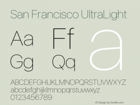
IntroductionSan Francisco 问世,苹果产品线的西文字体走向统一。从 MacBook 的键帽,到 OS X、iOS、watchOS
San Francisco 问世,苹果产品线的西文字体走向统一。从 MacBook 的键帽,到 OS X、iOS、watchOS 的界面用字……然而,“把盒子打开一看,里面是两款字体”。
翻开苹果西文字体史的最新章,本期将探访 San Francisco 这个大家族。
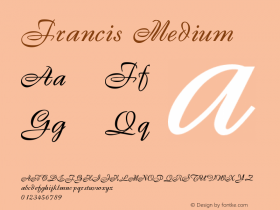
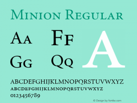
参考链接苹果公司 1984 年超级碗广告WWDC 2015 苹果开发者讲座录像:介绍系统新字体DIN 字体视觉字号(Optical Size)Minion 字体The Elements of Typographic StyleApple Watch:手表的重新构想微软关于字体排印传统的文章提到了阅读时眼睛聚焦部分基线、中线、升部、降部、大写字高的图示Georgia 字体西里尔字母越南文字母主播Eric:字体排印研究者,译者,Type is Beautiful 编辑蒸鱼:设计师,Type is Beautiful 编辑
欢迎与我们交流或反馈,来信请致 [email protected]。如果你喜爱本期节目,也欢迎用支付宝向我们捐赠,账户与联络信箱一致:[email protected]。

http://thetype.b0.upaiyun.com/typechat/typechat003.mp3
订阅地址|iTunes|下载音频
Relevant font family


字谈字畅 003:苹果字体极简史(下)“圣弗朗西斯科” Comments
字谈字畅 003:苹果字体极简史(下)“圣弗朗西斯科” Latest comments
No relevant comments
-
 ShanhaiFonts
Brand:山海字库
Area:China

-
 Cangji Fonts
Brand: 仓迹字库
Area: China
-
 JT Foundry
Brand: 翰字铸造
Area: Taiwan, China

-
 Handmadefont
Brand:
Area: Estonia

-
·千图字体
-
 HyFont Studio
Brand: 新美字库
Area: China


Recommended font article
- ·Benetton identity redesign
- ·Cher Got Sued For Font!
- ·Food Not Bombs hypothetical redesign
- ·MC5 – Back in the USA album cover
- ·Cocoa Marsh Instant Fudge Candy Mix packaging
- ·Iconic Transport for London logo undergoes subtle redesign
- ·"Jesus Music" ad for Myrrh Records
- ·Königsblut identity
- ·Hollywood Star Matt Damon Wrote Better Chinese than Chinese Stars
- ·How House Industries Designs Its Retrotastic Logos and Typefaces