How House Industries Designs Its Retrotastic Logos and Typefaces
IN 2000, ANDY Cruz and his coworkers at House Industries decided to create a font based on the legacy of designers Charles and Ray Eames. After immersing themselves in Eames archives at the Library of Congress and interviewing Herman Miller engineers, the type designers landed on a whimsical set of letters based on Ray’s handwriting. But when they presented it to Eames Demetrios, the famed designers’ grandson, he recoiled.

“He was very clear that we weren’t really bringing much to the table, as far as bringing some new thinking to the Eames story,” Cruz recalls. The feedback stung, but it was valuable. By that time, Cruz and the rest of House Industries had left their scrappy, upstart days behind them (the designers had recently released their wildly successful Neutra typeface, which you probably know as the Shake Shack font), but they’ve never grown allergic to criticism. In fact, if Cruz’s candid new monograph is any indication, receptivity has been essential to his type foundry’s success.
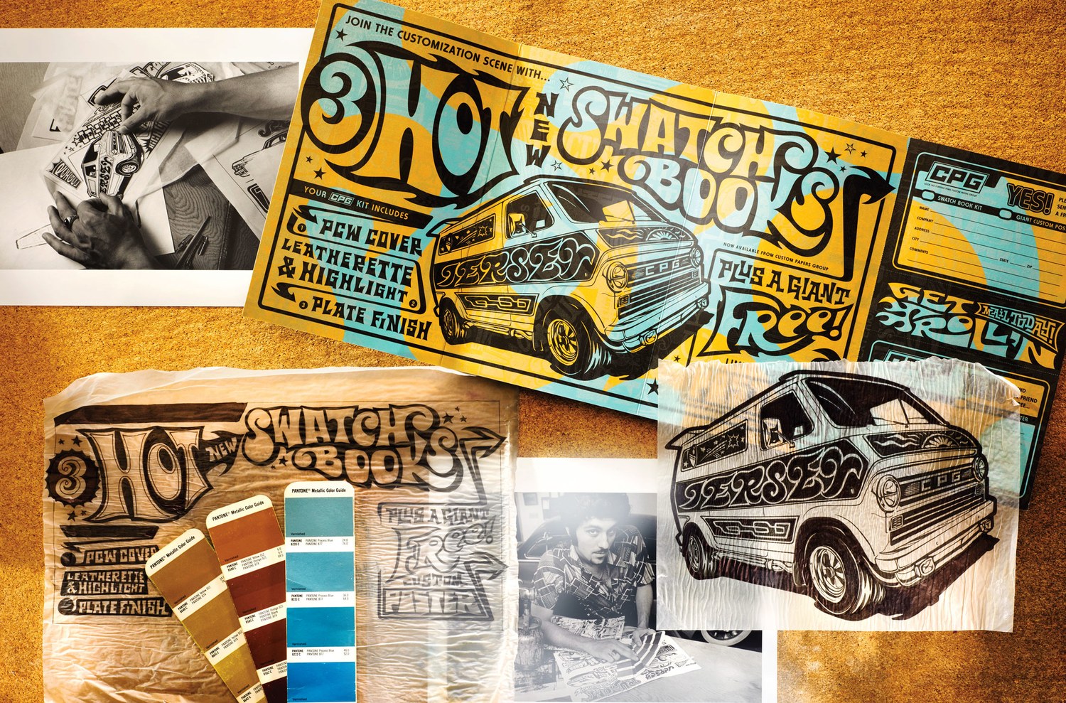
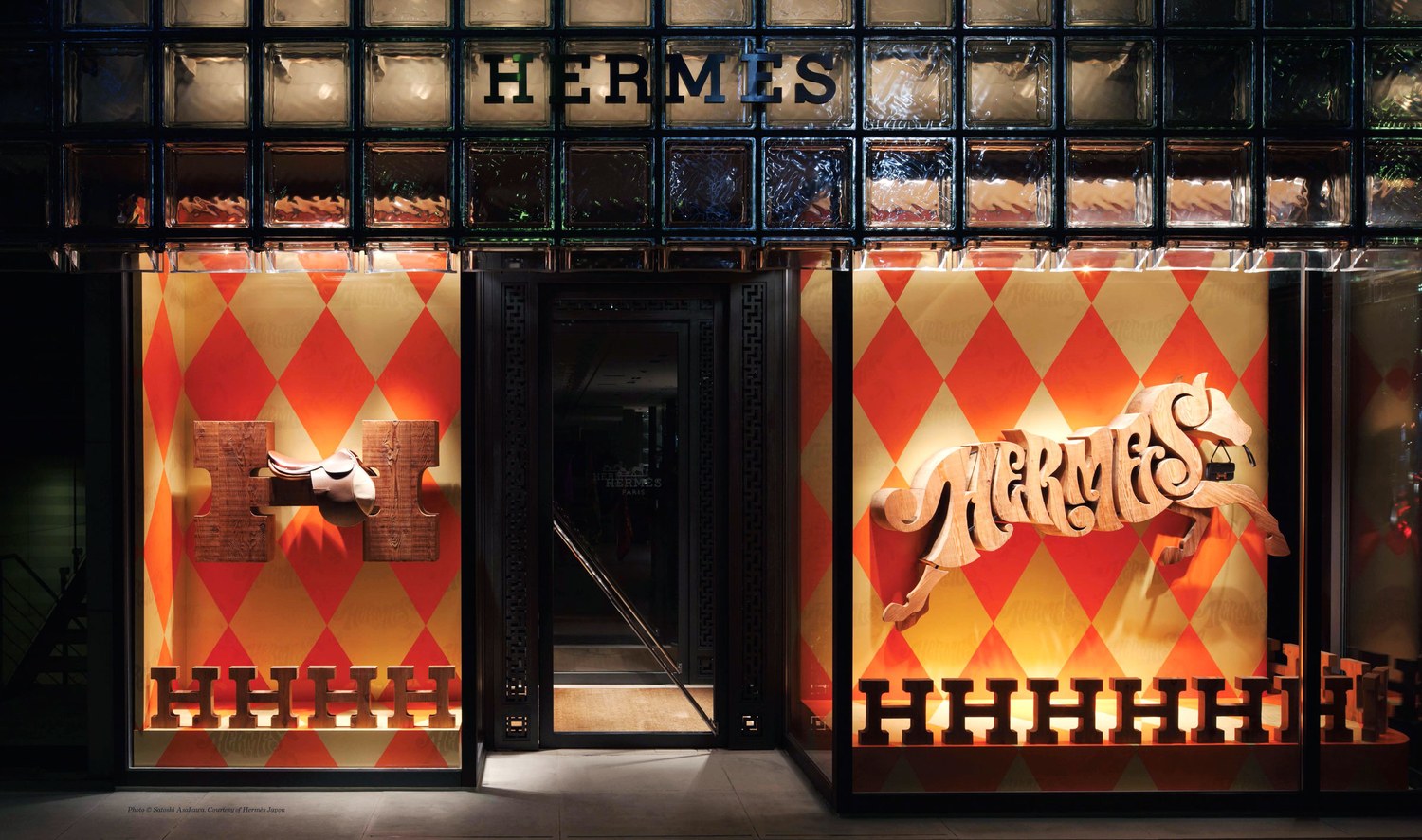
In House Industries: The Process Is the Inspiration ($50), Cruz joins co-founders Rich Roat and Ken Barber in reflecting on a quarter century’s worth of work. But rather than publish page after page of type designs and logos, Cruz, Roat, and Barber amassed case studies for a handful of notable projects, from a logo for Hermès Japan to a set of designs based on hot-rodding. Through detailed accounts, the designers candidly explore not just their successes but their failures—what inspired them, what tripped them up, and how they arrived at a finished product.
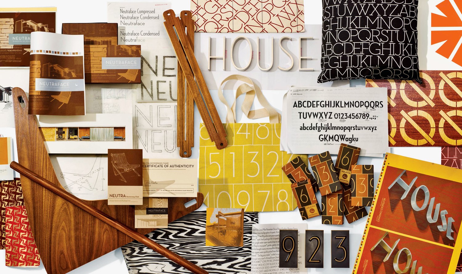
In the case of the Eames font collection, House Industries heeded Demetrios’s advice. “He showed us how to go back and try to build something that wasn’t a regurgitation of something we’d seen before, but a tool that could point to something we love about Eames,” Cruz says. The result was a typeface that channels Eames-ian principles like elegance, sturdiness, and economy of space without parroting any Eames ephemera.

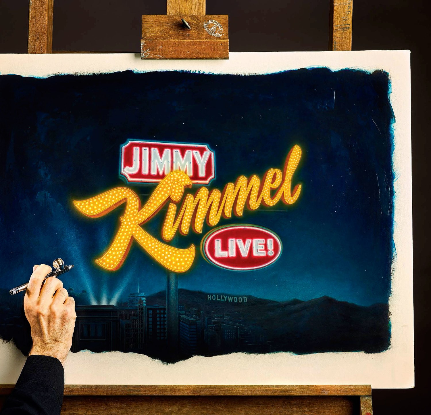
Understanding how to make vintage designs feel fresh has made House Industries popular with clients ranging from the Jimmy Kimmel Show to director JJ Abrams, a House Industries fanboy and author of the book’s introduction. But what Cruz and his colleagues took away from the Eames project is a fraction of what the designers have learned running House Industries these past 25 years. You’ll find a few choice examples of other lessons in the gallery above—and many more in the new monograph itself.
-
 Cangji Fonts
Brand: 仓迹字库
Area: China

-
 JT Foundry
Brand: 翰字铸造
Area: Taiwan, China

-
 Handmadefont
Brand:
Area: Estonia

-
·千图字体
-
 HyFont Studio
Brand: 新美字库
Area: China

-
 Minrui Type
Brand: 敏锐字库
Area: China

- ·Type terms: the animated typographic cheat sheet
- ·London Underground's iconic Johnston Sans typeface
- ·Once Upon DESIGN: New Routes for Arabian Heritage
- ·How to Read a Painting by Patrick de Rynck
- ·Surabaya Beat by Beat Presser, Afterhours Books
- ·MC5 – Back in the USA album cover
- ·Make market-ready fonts with this 8 point checklist
- ·Alphabet Stories by Hermann Zapf
- ·Ad for Vincebus Eruptum by Blue Cheer
- ·Statement and Counter-Statement, Automatically Arranged Alphabets, and Arts/Rats/Star


