


Fontke.com>Article>Details
Windows 7 不同主题、字体DPI对比
Introduction每当说起新版Windows,总会有不少“顽固人士”打听:从Windows 2000时代走来的经典主题现在是什么样子?在他们看来,花
每当说起新版Windows,总会有不少“顽固人士”打听:从Windows 2000时代走来的经典主题现在是什么样子?在他们看来,花里胡哨的用户界面只会浪费资源、降低性能、影响效率,只有经典的才是最好的。萝卜白菜各有所爱。不管谁喜欢什么样子的界面,都是个人喜欢,勉强不得。好在Windows 7里继续保留了经典界面,可以满足这部分用户了。以下就是Windows 7 M3 Build 6801的三种界面。当然,新系统现在还处于开发初期阶段,而用户界面的工作往往要到最后时刻才会确定,因此这里的对比只代表当前测试版的情况,最终版可能会有所不同。

半透明的Areo Glass

不透明的Areo Basic

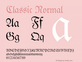
经典的Classic
顺便我们再看看Windows 7 M3里不同字体DPI(每英寸点数)的样子。Vista在这方面已经有了很大进步,Windows 7则继续加以完善,此前常见的文本破碎、布局错位、像素位图、字体错误等问题都得到了很好地解决,在各种比例下看起来都很舒服。
事实上,Windows 7在改变DPI的时候只需注销返回即可,而之前不得不重启一次,另外Windows 7甚至会在第一次安装的时候自动针对当前显示器选择最合适的DPI。

96DPI 100%

120DPI 125%

144DPI 150%

192DPI 200%
驱动之家编译

Relevant font foundry

Windows 7 不同主题、字体DPI对比 Comments
Windows 7 不同主题、字体DPI对比 Latest comments
No relevant comments
-
 ShanhaiFonts
Brand:山海字库
Area:China

-
 Cangji Fonts
Brand: 仓迹字库
Area: China
-
 JT Foundry
Brand: 翰字铸造
Area: Taiwan, China

-
 Handmadefont
Brand:
Area: Estonia

-
·千图字体
-
 HyFont Studio
Brand: 新美字库
Area: China


Recommended font article
- ·Amazon Releases Ember Bold Font for the Kindle
- ·47 free tattoo fonts for your body art
- ·How to Read a Painting by Patrick de Rynck
- ·How House Industries Designs Its Retrotastic Logos and Typefaces
- ·Top 100 Fonts.com Web Fonts for May 2016
- ·Brother Moto Flat-Trackin' Tee
- ·London Underground's iconic Johnston Sans typeface
- ·Antropofagia. Palimpsesto Selvagem
- ·Bevésett nevek (Carved Names), vol. 2
- ·The Form Book by Borries Schwesinger