


"Art Works" ad, Privatbank Berlin


Photo: Florian Hardwig. Privatbank Berlin. License: All Rights Reserved.
Ad in ZEIT GELD, March 2016.
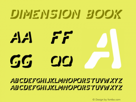
First time I've seenQuantenin use. This design by Martin Aleith (Gestalten, 2014) is one of several "impossible" typeface designs released in recent years, spearheaded by the much acclaimed Macula (2012). The pretended three-dimensionality in Quanten is achieved by letting its continuous outline oscillate between the interior and the exterior. In this regard, the design is more successful than the relatively stiff Continuo (caps only, 1996), Relava (2008) or Kelso (2014). Related designs with an equally convoluted outline, but round corners and terminals (and hence the impression of a bent piece of wire) include Morice (2005) and Clip (2011).
In a previous leaflet (see below), Museo Slab is paired with the straightforward FF Clan. The brand communication concept for Privatbank Berlin was Charter.

Source: http://privatbank.berlin.Privatbank Berlin. License: All Rights Reserved.


-
 ShanhaiFonts
Brand:山海字库
Area:China

-
 Cangji Fonts
Brand: 仓迹字库
Area: China
-
 JT Foundry
Brand: 翰字铸造
Area: Taiwan, China

-
 Handmadefont
Brand:
Area: Estonia

-
·千图字体
-
 HyFont Studio
Brand: 新美字库
Area: China


- ·Amazon Releases Ember Bold Font for the Kindle
- ·47 free tattoo fonts for your body art
- ·How to Read a Painting by Patrick de Rynck
- ·How House Industries Designs Its Retrotastic Logos and Typefaces
- ·Top 100 Fonts.com Web Fonts for May 2016
- ·Brother Moto Flat-Trackin' Tee
- ·London Underground's iconic Johnston Sans typeface
- ·Antropofagia. Palimpsesto Selvagem
- ·Bevésett nevek (Carved Names), vol. 2
- ·The Form Book by Borries Schwesinger