


The New York Times Magazine, 2013 Innovations Issue, Online Edition


Source: http://www.nytimes.com.License: All Rights Reserved.
The New York Times Magazine did something new with the online edition of their print edition designed by Arem Duplessis.
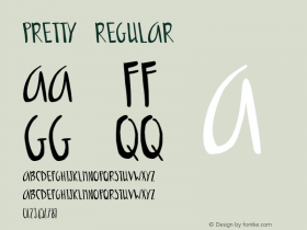
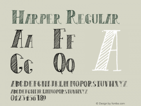
The typefaces areLL Circular, a new release from Lineto which even gets a mention up front,A2 Beckettfor headlines,Georgiafor text, and just a dash of the NYT's custom bold condensedStymieon the front page. The format isn't complex, but it feels like a pretty special edition of the magazine due to the unique packaging, navigation, colors, and especially the type. The design also responds quite well to narrow window sizes
I have only two complaints. Some of the color backgrounds are a little too strong for reading, especially when they also include a halftone image like the "Sleep-Away Camp" article below. To counteract this, the designers added a tiny white drop shadow to the text (an increasingly popular practice on the web), but I think this does more harm than good — though the effect is sharper and more distracting in some of these screenshots (shown at reduced size) than as I experienced it in the browser.
The other beef is minor: the right margin is slightly cropped for me (see the comments link at top of all pages), probably because they only tested on a Mac which had the default hidden OS X scrollbars that only appear when scrolling. Oops.

Source: http://www.nytimes.com.License: All Rights Reserved.

Source: http://www.nytimes.com.License: All Rights Reserved.

Source: http://www.nytimes.com.License: All Rights Reserved.
Props for hanging the quote!

Source: http://www.nytimes.com.License: All Rights Reserved.

Source: http://www.nytimes.com.License: All Rights Reserved.

Source: http://www.nytimes.com.License: All Rights Reserved.

Source: http://www.nytimes.com.License: All Rights Reserved.

Source: http://www.nytimes.com.License: All Rights Reserved.

Source: http://www.nytimes.com.License: All Rights Reserved.
I don't want to read this. That background image is just too intrusive.

Source: http://www.nytimes.com.License: All Rights Reserved.


-
 ShanhaiFonts
Brand:山海字库
Area:China

-
 Cangji Fonts
Brand: 仓迹字库
Area: China
-
 JT Foundry
Brand: 翰字铸造
Area: Taiwan, China

-
 Handmadefont
Brand:
Area: Estonia

-
·千图字体
-
 HyFont Studio
Brand: 新美字库
Area: China


- ·Cocoa Marsh Instant Fudge Candy Mix packaging
- ·Hollywood Star Matt Damon Wrote Better Chinese than Chinese Stars
- ·Jim Nutt: Coming Into Character at Museum of Contemporary Art Chicago
- ·Sinnesreize / Embracing Sensation by Silvia Gertsch and Xerxes Ach
- ·Fonts Design of Childhood Memory
- ·Surabaya Beat by Beat Presser, Afterhours Books
- ·How House Industries Designs Its Retrotastic Logos and Typefaces
- ·"Die Alpen – Vielfalt in Europa" stamp
- ·Statement and Counter-Statement, Automatically Arranged Alphabets, and Arts/Rats/Star
- ·Type terms: the animated typographic cheat sheet