


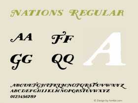
Meta-morphosis: How FF MetaPlus Became FF Meta
When we see the expansive superfamily that FF Meta has become, it's hard to believe its beginnings were so humble. As the family has known three different incarnations, there tends to be some confusion about which version is which. So let's clear the air and explore the history of the most successful humanist sans of the previous decade, "the Helvetica of the nineties".
Originally, back in 1991 when the second batch of FontFonts was released, there wasFF Meta(Normal, Bold, Small Caps). One of the defining characteristics of FF Meta — and FontFonts in general — was the presence of hanging (or oldstyle) figures and additional ff-ligatures in the "regular" Normal and Bold weights, while lining figures were found in the Small Caps weight. The distinctive Meta arrow occupied the slots for the lesser-than and greater-than symbols.
The first expansion came in 1992 withFF Meta 2, adding three more weights (Italic, Italic Small Caps, Bold Small Caps).
FF MetaPlus(not "Meta Plus" as it's often mistyped), released in 1993, was the big leap forward. It introduced three new weights — which effectively tripled the number of fonts to 18 — and included a fine-tuning of some characters (most notably a correction of the crossbar on the lc 't') and revisions of spacing and kerning. The family at that point featured Normal, Book, Medium, Bold and Black weights, all in Roman, Italic, Small Caps and Italic Small Caps (except for the Black weight which didn't include Small Caps). Still hanging figures in the 'regular' weights and lining figures in the Small Caps. The latter featured the Meta arrow, while lesser-than and greater-than symbols were added to the "regular" fonts.
Eventually, in 1998 it was back toFF Meta. This saw a reorganisation of the family into subfamilies: FF Meta Normal, FF Meta Book, FF Meta Medium, FF Meta Bold and FF Meta Black, all in Roman, Italic, Small Caps and Italic Small Caps, which all got coupled with their respective Expert and Lining Figures weights: yep, a whopping 60 fonts indeed. Biggest change this time was the addition of the Black Small Caps, and moving of the extra ligatures (ff, ffi, ffl which were previously in the "regular" fonts) to the new Expert fonts. And of course the Lining figures weights meant that you don't have to switch between "regular" fonts and Small Caps fonts anymore to get the desired type of numerals.
Of course the story doesn't end there, as the latest — and definitive — incarnation of FF Meta got subsequently expanded with foreign language versions, a Condensed family, additional light weights (Light, Hairline, and Thin) and just recently a group of Headline cuts.
So, to conclude — never mix the original six weight FF Meta with FF MetaPlus nor the new FF Meta family, as it has different spacing and kerning, and some redesigned characters. Substituting FF Meta for FF MetaPlus is recommended, but keep in mind that ff-ligatures will disappear and types of numerals might differ.


-
 Cangji Fonts
Brand: 仓迹字库
Area: China

-
 JT Foundry
Brand: 翰字铸造
Area: Taiwan, China

-
 Handmadefont
Brand:
Area: Estonia

-
·千图字体
-
 HyFont Studio
Brand: 新美字库
Area: China
-
 Minrui Type
Brand: 敏锐字库
Area: China


- ·Hollywood Star Matt Damon Wrote Better Chinese than Chinese Stars
- ·How House Industries Designs Its Retrotastic Logos and Typefaces
- ·Statement and Counter-Statement, Automatically Arranged Alphabets, and Arts/Rats/Star
- ·Alibaba Supports Font Infringement Complaints
- ·New York New York, Jazz St. Louis
- ·How to sell your typefaces
- ·Iconic Transport for London logo undergoes subtle redesign
- ·Brother Moto Flat-Trackin' Tee
- ·Linotype Ad: "Linotype vs. Intertype"
- ·47 free tattoo fonts for your body art