Poirot Series 1 DVD Set


Source: http://www.marksimonson.com.License: All Rights Reserved.
Mark SImonson:
Back in 1991, I designed a series of packages for the American release of London Weekend Television's Poirot series on VHS. (My design is above on the left.) As part of the design, I drew the name "POIROT" in a geometric Art Deco style, which I thought was fitting for the series.
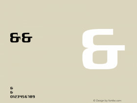
The other day, I happened to see the latest incarnation of the series packaging (above on the right) and noticed that the designer had set the title in one of my fonts, Mostra, which I never noticed before is pretty similar to my 1991 lettering design.
I wonder if they knew?
-
 ShanhaiFonts
Brand:山海字库
Area:China

-
 Cangji Fonts
Brand: 仓迹字库
Area: China

-
 JT Foundry
Brand: 翰字铸造
Area: Taiwan, China

-
 Handmadefont
Brand:
Area: Estonia

-
·千图字体
-
 HyFont Studio
Brand: 新美字库
Area: China

- ·The Form Book by Borries Schwesinger
- ·The Future of Sex poster
- ·10 Top Romantic Fonts on Valentine's Day!
- ·Chinese College Student Invents Smog Font
- ·Food Not Bombs hypothetical redesign
- ·Japanese Typography Writing System
- ·How to Read a Painting by Patrick de Rynck
- ·Linotype Ad: "Linotype vs. Intertype"
- ·Top 100 Fonts.com Web Fonts for May 2016
- ·How House Industries Designs Its Retrotastic Logos and Typefaces


