If Movies Had Opening Titles With Crappy Fonts…

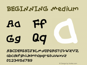
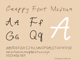
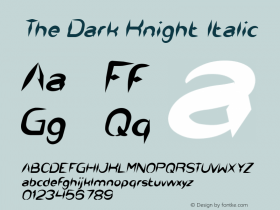
As you may very well know I often rail against poor typographic choices for movie posters and credit title sequences. However it could be even worse, and after seeing the remix video If Movies Had Crappy Fonts I feel like such a snob. Jest – the latest website under the CollegeHumor Media umbrella – asks if using the wrong typeface in the opening titles can ruin an entire movie. Find out for yourself with this Jest original re-imagining the beginning of famous films like Star Wars, The Dark Knight Rises, Drive, and more… with crappy typography. Make sure you wait for the pay-off.
-
 ShanhaiFonts
Brand:山海字库
Area:China

-
 Cangji Fonts
Brand: 仓迹字库
Area: China

-
 JT Foundry
Brand: 翰字铸造
Area: Taiwan, China

-
 Handmadefont
Brand:
Area: Estonia

-
·千图字体
-
 HyFont Studio
Brand: 新美字库
Area: China

- ·Iconic Transport for London logo undergoes subtle redesign
- ·Brother Moto Flat-Trackin' Tee
- ·47 free tattoo fonts for your body art
- ·10 Top Romantic Fonts on Valentine's Day!
- ·Quimbaya Coffee Roasters
- ·Statement and Counter-Statement, Automatically Arranged Alphabets, and Arts/Rats/Star
- ·Hollywood Star Matt Damon Wrote Better Chinese than Chinese Stars
- ·Alphabet Stories by Hermann Zapf
- ·MC5 – Back in the USA album cover
- ·Linotype Ad: "Linotype vs. Intertype"


