


National Punctuation Day Reignites Interrobang Passion

America seems to have a particular habit of designating hundreds of special days in celebration of niche interests to the extent that every day of the year is packed with unofficial holidays and observances. Well here's one I can get behind: National Punctuation Day. Not only is it purely typographic in nature, it also offers me an excuse to trump my favorite forgotten punctuation, the interrobang. Wikipedia describes it well: "a nonstandard English-language punctuation mark intended to combine the functions of the question mark (also called the interrogative point) and the exclamation mark or exclamation point (known in printers' jargon as the bang)". Here's a little history:
In 1966, Richard Isbell of American Type Founders issued the Americana typeface and included the interrobang as one of the characters. In 1968, an interrobang key was available on some Remington typewriters. During the 1970s, it was possible to buy replacement interrobang keycaps and strikers for some Smith-Corona typewriters. The interrobang was in vogue for much of the 1960s, with the word "interrobang" appearing in some dictionaries and the mark itself being featured in magazine and newspaper articles.
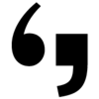
I submit that the reason the interrobang didn't catch on is due mostly to its design. The smashing of straight and curved vertical strokes atop each other is hardly a graceful combination, and it gets especially messy at text sizes (‽). Were it drawn more thoughtfully like those of Christian Schwartz's Amplitude and Fritz, the interrobang might be part of our standard punctuation today, a member of the basic Latin character set, and common in our written vernacular.
Interrobangs from Amplitude and Fritz by Christian Schwartz for the Font Bureau.
Which brings me to some other punctuational news. According to the Punctuation Day site, "Punctuation Man breaks with Associated Press, endorses serial comma!"
In support of the National Education Association's "Read Across America" program on March 3, the nation's leading authority on helping school children, teachers, and parents learn proper punctuation skills declares that the serial comma should be taught, used, and accepted universally.
Amen. I have long been a champion of the Oxford/Harvard/serial comma and I'm pleased to have anyone, no matter how silly their title, behind me. Go, fight, and win!
Header image:Students at a school in Auburn, Michigan celebrate National Punctuation Day.


-
 ShanhaiFonts
Brand:山海字库
Area:China

-
 Cangji Fonts
Brand: 仓迹字库
Area: China
-
 JT Foundry
Brand: 翰字铸造
Area: Taiwan, China

-
 Handmadefont
Brand:
Area: Estonia

-
·千图字体
-
 HyFont Studio
Brand: 新美字库
Area: China


- ·Food Not Bombs hypothetical redesign
- ·Königsblut identity
- ·"Jesus Music" ad for Myrrh Records
- ·XUID Arrays: One Less Thing To Worry About
- ·Troubadour poster, Opera Plovdiv
- ·How to Read a Painting by Patrick de Rynck
- ·Top 100 Fonts.com Web Fonts for May 2016
- ·The Form Book by Borries Schwesinger
- ·Iconic Transport for London logo undergoes subtle redesign
- ·New York New York, Jazz St. Louis