Shots in the Attic


Invitation card for opening party of Nina Stössinger's studio. Click to enlarge.
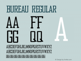
For the eternal question of how to combine typefaces, contrast is often the answer. Look to pair fonts from different classifications, of different weights, or styles. Like Courrier International, this invitation by Nina Stössinger hits all three of those points. The card uses only two fonts:Bureau Grot Black, a heavy bludgeon of a sans, andWhitman, a serif with an elegant italic.

Click to enlarge.
Nina achieved harmony between such opposites within the same paragraph by sizing the type so the x-heights matched. It also helps that, though Whitman was made in 2008, neither typeface is an ultra modern design. They feel like they come from similar eras.
-
 ShanhaiFonts
Brand:山海字库
Area:China

-
 Cangji Fonts
Brand: 仓迹字库
Area: China

-
 JT Foundry
Brand: 翰字铸造
Area: Taiwan, China

-
 Handmadefont
Brand:
Area: Estonia

-
·千图字体
-
 HyFont Studio
Brand: 新美字库
Area: China

- ·Once Upon DESIGN: New Routes for Arabian Heritage
- ·Antropofagia. Palimpsesto Selvagem
- ·The Future of Sex poster
- ·He Invented a Font to Help People With Dyslexia Read
- ·Chinese College Student Invents Smog Font
- ·Ad for Hello Dummy! by Don Rickles
- ·MC5 – Back in the USA album cover
- ·Amazon Releases Ember Bold Font for the Kindle
- ·Hollywood Star Matt Damon Wrote Better Chinese than Chinese Stars
- ·Königsblut identity


