


HP’s cool new logo is actually one it rejected five years ago
HP Premium laptops will have a premium, shiny, new logo. Well, kind of new. The design was actually submitted five years ago by Moving Brands – one that HP eventually decided against to the disappointment of many.

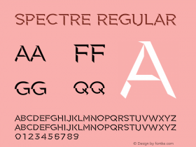
HP’s corporate logo has remained pretty much the same for 75 years straight – blockish letters in a circle – though the current iteration was created in 2010. But its Spectre laptop range is back again to shake things up with Spectre 13, aka the world's thinnest laptop, which is adorned with the much-loved, previously rejected logo by Moving Brands. Non-standard logos are actually almost standard when it comes to Spectre laptops, with last year's Spectre x360 having 'Hewlett-Packard' written out - but HP will extend this sleek new logo across its entire premium laptop range.

But the logo itself looks good. The branding is clear despite the minimalism of four slanty lines. For HP’s higher-paying premium customers, the logo is a gentle reminder of the more slap-you-round-the-face, main corporate logo.


-
 ShanhaiFonts
Brand:山海字库
Area:China

-
 Cangji Fonts
Brand: 仓迹字库
Area: China
-
 JT Foundry
Brand: 翰字铸造
Area: Taiwan, China

-
 Handmadefont
Brand:
Area: Estonia

-
·千图字体
-
 HyFont Studio
Brand: 新美字库
Area: China


- ·Quimbaya Coffee Roasters
- ·How to Read a Painting by Patrick de Rynck
- ·Sinnesreize / Embracing Sensation by Silvia Gertsch and Xerxes Ach
- ·Ad for Vincebus Eruptum by Blue Cheer
- ·New York New York, Jazz St. Louis
- ·How House Industries Designs Its Retrotastic Logos and Typefaces
- ·Moving Hands (Helena Hauff Remix) by The Klinik, official video
- ·Statement and Counter-Statement, Automatically Arranged Alphabets, and Arts/Rats/Star
- ·Alibaba Supports Font Infringement Complaints
- ·Japanese Typography Writing System