


Intertype ads: "Intertype vs Linotype"


Source: https://books.google.com.Scanned by Google Books. University of Minnesota Collection. License: Public Domain.

Source: https://books.google.com.Scanned by Google Books. University of Minnesota Collection. License: Public Domain.
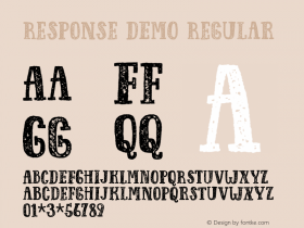
Intertype placed several brash advertisements in The Inland Printer during the trade magazine's 1913 run. The first ad is a direct response to Linotype's claim of patent infringement. In a slightly ironic twist, some of the ads (below) use the same typeface as Linotype's ad,Caslon 3.

Source: https://books.google.com.Scanned by Google Books. University of Minnesota Collection. License: Public Domain.

Source: https://books.google.com.Scanned by Google Books. University of Minnesota Collection. License: Public Domain.


-
 ShanhaiFonts
Brand:山海字库
Area:China

-
 Cangji Fonts
Brand: 仓迹字库
Area: China
-
 JT Foundry
Brand: 翰字铸造
Area: Taiwan, China

-
 Handmadefont
Brand:
Area: Estonia

-
·千图字体
-
 HyFont Studio
Brand: 新美字库
Area: China


- ·Statement and Counter-Statement, Automatically Arranged Alphabets, and Arts/Rats/Star
- ·Barbe à papa Cotton Candy
- ·Why Apple Abandoned the World's Most Beloved Typeface?
- ·Top 100 Fonts.com Web Fonts for May 2016
- ·Ad for Vincebus Eruptum by Blue Cheer
- ·Surabaya Beat by Beat Presser, Afterhours Books
- ·Chinese College Student Invents Smog Font
- ·The Great Comic Book Heroes, by Jules Feiffer
- ·How to Read a Painting by Patrick de Rynck
- ·How to sell your typefaces