6 tips for perfect font pairing
When pairing fonts there are no firm rules. There will always be new combinations that turn out to look great. For many however, it's helpful to stick to some basic guidelines in order to ensure a great looking typographic design.
You will, of course, need some fonts to experiment on and play with. We've got a selection of free fonts, including handwriting fonts and graffiti fonts, and a guide to choosing web fonts to help you get started.
Here's our guide to font pairing's basics...
01. Content First
Before even considering what fonts to use make sure content is well written. Beautiful typography cannot save bad content. Good typography will put the reader's focus on the content, so make sure the content is clear and effective.
02. Keep it simple
Today, designers have endless options when it comes to choosing type. It can easily become overwhelming. One can excel using a single font if it has a versatile font family with a good range of font weights. Using two different fonts, one for headings and one for body text, is a common and effective tactic.
03. Contrast
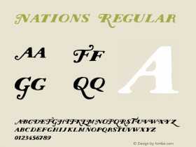
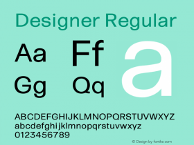
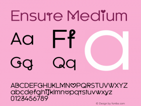
When using two different fonts, make sure they have plenty of contrast. An easy way to achieve this is to use sans-serif/serif or serif/sans-serif font pairings. Fonts paired together that have different weights and styles tend to contrast well together. You can also use slightly different color shades between fonts to bring visual hierarchy and balance to the design.
 Font pairing is both and art and science. Mills Digital's Font Pair can help designers select and set contrasting Google fonts04. Ensure readability
This might go without saying, but its important to test the fonts before implementing them into a design. Ensure the fonts function well together. What is the context in which you are using them? Is it a readable font pair for a laptop and a mobile phone browser? Will the reader be able to distinguish between the heading and body fonts?
05. Use resources
There are tons of typographic resources on the web today that can be super helpful when trying to pair different fonts together. Sites like Typewolf offer inspiration and updates on trends and popular fonts currently being used on the web. Using resources as guidelines can help you achieve better looking results.
06. Explore
It's important to note that pairing fonts is a completely subjective decision that the designer must make for their particular design. It's vital to explore different pairings and test for yourself what works best. Don't be afraid to try new pairs!
-
 Cangji Fonts
Brand: 仓迹字库
Area: China

-
 JT Foundry
Brand: 翰字铸造
Area: Taiwan, China

-
 Handmadefont
Brand:
Area: Estonia

-
·千图字体
-
 HyFont Studio
Brand: 新美字库
Area: China

-
 Minrui Type
Brand: 敏锐字库
Area: China

- ·10 Top Romantic Fonts on Valentine's Day!
- ·"David Bowie is turning us all into voyeurs" button
- ·Why Apple Abandoned the World's Most Beloved Typeface?
- ·Top 100 Fonts.com Web Fonts for May 2016
- ·Ad for Vincebus Eruptum by Blue Cheer
- ·Amazon Releases Ember Bold Font for the Kindle
- ·Moving Hands (Helena Hauff Remix) by The Klinik, official video
- ·"Jesus Music" ad for Myrrh Records
- ·Statement and Counter-Statement, Automatically Arranged Alphabets, and Arts/Rats/Star
- ·Antropofagia. Palimpsesto Selvagem


