


Fontke.com>Article>Details
A colorful typographic identity for Get Set festival
IntroductionBased in Porto, Portugal, Get Set Festival is an event where crea
Based in Porto, Portugal, Get Set Festival is an event where creative people gather. It features conferences, workshops, and performances by creative individuals and studios.
The Festival organizers commissionned Epiforma to create the event's visual identity. The Portuguese graphic design studio took on it with bold colors and a creative use of type. Even with the letters of the logo partly covered, it stays surprisingly readable. The use of many bright colors in the identity helps to give it the look-and-feel of the creative environment the festival offers.
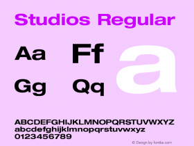
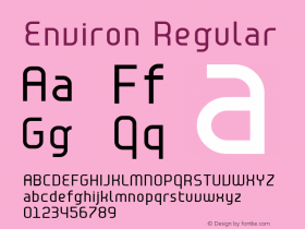
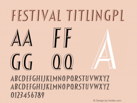
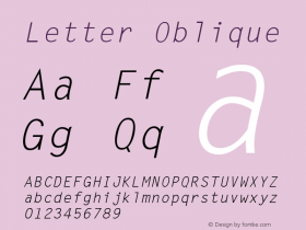
Relevant font family


A colorful typographic identity for Get Set festival Comments
A colorful typographic identity for Get Set festival Latest comments
No relevant comments
-
 ShanhaiFonts
Brand:山海字库
Area:China

-
 Cangji Fonts
Brand: 仓迹字库
Area: China
-
 JT Foundry
Brand: 翰字铸造
Area: Taiwan, China

-
 Handmadefont
Brand:
Area: Estonia

-
·千图字体
-
 HyFont Studio
Brand: 新美字库
Area: China


Recommended font article
- ·Barbe à papa Cotton Candy
- ·Königsblut identity
- ·Fonts Design of Childhood Memory
- ·10 Top Romantic Fonts on Valentine's Day!
- ·Ad for Vincebus Eruptum by Blue Cheer
- ·Cher Got Sued For Font!
- ·Antropofagia. Palimpsesto Selvagem
- ·XUID Arrays: One Less Thing To Worry About
- ·The Future of Sex poster
- ·Statement and Counter-Statement, Automatically Arranged Alphabets, and Arts/Rats/Star