


Design Museum identity (2003, 2016)


Source: http://www.graphicthoughtfacility.com.License: All Rights Reserved.
Design Museum identity adopted in 2003.

Source: http://www.graphicthoughtfacility.com.License: All Rights Reserved.

Source: https://www.flickr.com.Image via "observista" on Flickr. License: All Rights Reserved.
In 2003,

Trademark: FontShop International GmbH. License: All Rights Reserved.
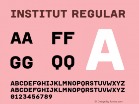
The Design Museum's ID font is a combo of various glyphs from FF Schulbuch Nord and Süd. The Akzidenz-Grotesk-style 'R' was a unique addition.
The logo comes fromFF Schulbuch, a typeface series derived from the various standards of German schoolbook authorities. The core of this design, especially FF Schulbuch Nord, is very similar to Helvetica (besides Schulbuch's "early reader" forms of FF Schulbuch Süd, which serves most of the Design Museum identity, has several distinctive shapes ('G, I, J, M, R, t, u, y') based on German writing models. The

Source: https://designmuseum.org.License: All Rights Reserved.
2015 Annual Review using the Design Museum's custom version of FF Schulbuch Süd. (Click to enlarge.)
2016 Identity Update
This week, in advance of the institution's

Source: https://www.facebook.com.License: All Rights Reserved.

Source: http://www.designweek.co.uk.License: All Rights Reserved.

Source: http://www.designweek.co.uk.License: All Rights Reserved.
Studio Fernando Gutiérrez brings the museum's custom typeface – or at least its spirit – into the logo and other accompanying wordmarks. The designers did make some adjustments to the type: "the" appears to come fromNeue Helveticainstead of FF Schulbuch.

Logos © Design Museum. Comparison image by Stephen Coles. License: All Rights Reserved.
The original "DESIGN MUSEUM" mark has been revised as well, with the most apparent change to the 'G', which now curves inward slightly at the edge of the horizontal stroke, and has a rounder, more balanced feel. That old Schulbuch 'G' does seem to lean forward a bit, calling attention to itself, and if the point of this identity is to embue modernity, but not stand out too much, these little changes make a lot of sense.
Of course, some might say that Helvetica roots are too Swiss for a British institution, but after 13 years of speaking in this particular typographic voice, the Design Museum would sound strange using any other dialect.


-
 ShanhaiFonts
Brand:山海字库
Area:China

-
 Cangji Fonts
Brand: 仓迹字库
Area: China
-
 JT Foundry
Brand: 翰字铸造
Area: Taiwan, China

-
 Handmadefont
Brand:
Area: Estonia

-
·千图字体
-
 HyFont Studio
Brand: 新美字库
Area: China


- ·Why Apple Abandoned the World's Most Beloved Typeface?
- ·How to sell your typefaces
- ·MC5 – Back in the USA album cover
- ·Alphabet Stories by Hermann Zapf
- ·Fonts Design of Childhood Memory
- ·Statement and Counter-Statement, Automatically Arranged Alphabets, and Arts/Rats/Star
- ·Top 100 Fonts.com Web Fonts for May 2016
- ·Barbe à papa Cotton Candy
- ·Linotype Ad: "Linotype vs. Intertype"
- ·Ad for Hello Dummy! by Don Rickles