


Taylor Stitch (2015 website)


Source: https://www.taylorstitch.com.License: All Rights Reserved.
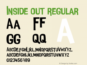
Nice jacket, but you're wearing your apostrophe inside out. That's an opening quotation mark. The abbreviation for 1968 is '68.
Trade GothicBold, giving the brand a no-nonsense, workmanlike appeal — a nod to vintage labels, but without too much nostalgia. For the headlines and other text,GeorgiaLight (a weight of the classic web standby that was released in 2013 as part of straight or opening quote marks instead of proper ones). I'm also not big on the gaping line-height on some of these pages, but we beat that bugaboo to death in other reviews.
This version of the site was designed by Christopher Morben under the direction of co-founder Michael Armenta. The good news for the designers is that these few typography foibles are easily adjusted. Taylor Stitch has acheived a look that feels high end; they just need to sew up some loose ends.

Source: https://www.taylorstitch.com.License: All Rights Reserved.
They straightened out the apostrophe here, but it's still not worthy of Georgia or the attire.

Source: https://www.taylorstitch.com.License: All Rights Reserved.
These clothes are smarter than their apostrophes.

Source: https://www.taylorstitch.com.License: All Rights Reserved.
Headline/background contrast not so good.

Source: https://www.taylorstitch.com.License: All Rights Reserved.
Poor headline/background contrast, and (for my taste) this leading is far too loose-fitting.

Source: https://www.taylorstitch.com.License: All Rights Reserved.
Great headline/background contrast.

Source: https://www.taylorstitch.com.License: All Rights Reserved.
"F Q" — but ok, you know what it says.

Source: https://www.taylorstitch.com.License: All Rights Reserved.
A partially obscured headline is one thing, but this text is really asking too much of its readers.

Source: https://www.taylorstitch.com.License: All Rights Reserved.

Source: https://www.taylorstitch.com.License: All Rights Reserved.

Source: https://www.taylorstitch.com.License: All Rights Reserved.
Airy is the current trend in web design, but this is the roomiest cart I've ever seen. It's certainly calming. Maybe it calms customers into calmly pushing the checkout button.


-
 ShanhaiFonts
Brand:山海字库
Area:China

-
 Cangji Fonts
Brand: 仓迹字库
Area: China
-
 JT Foundry
Brand: 翰字铸造
Area: Taiwan, China

-
 Handmadefont
Brand:
Area: Estonia

-
·千图字体
-
 HyFont Studio
Brand: 新美字库
Area: China


- ·Once Upon DESIGN: New Routes for Arabian Heritage
- ·Sinnesreize / Embracing Sensation by Silvia Gertsch and Xerxes Ach
- ·Benetton identity redesign
- ·The Great Comic Book Heroes, by Jules Feiffer
- ·Japanese Typography Writing System
- ·Hollywood Star Matt Damon Wrote Better Chinese than Chinese Stars
- ·Cocoa Marsh Instant Fudge Candy Mix packaging
- ·Chinese College Student Invents Smog Font
- ·Troubadour poster, Opera Plovdiv
- ·New York New York, Jazz St. Louis