


Estonian Farm Architecture


Source: http://aku.co.AKU. License: All Rights Reserved.
AKU:
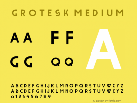
The exhibition concentrates on the later part of Estonian farm architecture (from mid-19th to mid-20th century. A revival of an early 20th century grotesk was therefor chosen as the text typeface and a modern, slightly robust serif as the headline font. The bold typography complements the minimal white structures resembling the shape of a farm house.
Exhibition design: KAMP Architects
Exhibition photos: Terje Ugandi

Source: http://aku.co.AKU. License: All Rights Reserved.

Source: http://aku.co.AKU. License: All Rights Reserved.

Source: http://aku.co.AKU. License: All Rights Reserved.

Source: http://aku.co.AKU. License: All Rights Reserved.


-
 ShanhaiFonts
Brand:山海字库
Area:China

-
 Cangji Fonts
Brand: 仓迹字库
Area: China
-
 JT Foundry
Brand: 翰字铸造
Area: Taiwan, China

-
 Handmadefont
Brand:
Area: Estonia

-
·千图字体
-
 HyFont Studio
Brand: 新美字库
Area: China


- ·47 free tattoo fonts for your body art
- ·Cher Got Sued For Font!
- ·Statement and Counter-Statement, Automatically Arranged Alphabets, and Arts/Rats/Star
- ·XUID Arrays: One Less Thing To Worry About
- ·Japanese Typography Writing System
- ·How House Industries Designs Its Retrotastic Logos and Typefaces
- ·Surabaya Beat by Beat Presser, Afterhours Books
- ·He Invented a Font to Help People With Dyslexia Read
- ·Iconic Transport for London logo undergoes subtle redesign
- ·How to sell your typefaces