


Eileen Fisher logo


Source: https://www.facebook.com.License: All Rights Reserved.
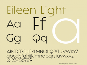
The mark for women's clothing label Eileen Fisher is set in a slighly condensed MetroLite fromMetro No. 2, which is very representative of the brand's design: understated, spare, light, modern with a touch of humanism. I do question the spacing, however: someone felt the need to vertically align the 'L' with the 'S', yet the 'E' not quite with the 'H', ignoring the large space created between 'L' and 'E' in the first line. Once you read "EIL EEN", you cannot unread it.

Source: http://www.eileenfisher.com.License: All Rights Reserved.

Source: http://www.sergiokurhajec.com.License: All Rights Reserved.

Source: http://www.sergiokurhajec.com.License: All Rights Reserved.

Source: http://www.manrepeller.com.License: All Rights Reserved.


-
 Cangji Fonts
Brand: 仓迹字库
Area: China

-
 JT Foundry
Brand: 翰字铸造
Area: Taiwan, China

-
 Handmadefont
Brand:
Area: Estonia

-
·千图字体
-
 HyFont Studio
Brand: 新美字库
Area: China
-
 Minrui Type
Brand: 敏锐字库
Area: China


- ·Cher Got Sued For Font!
- ·Why Apple Abandoned the World's Most Beloved Typeface?
- ·"Fantastic!" ad for Captain Fantastic & the Brown Dirt Cowboy by Elton John & Bernie Taupin
- ·20 Houses. A New Residential Landscape exhibition, Wallpaper* Architects Directory
- ·Hollywood Star Matt Damon Wrote Better Chinese than Chinese Stars
- ·Alibaba Supports Font Infringement Complaints
- ·Fonts Design of Childhood Memory
- ·Chinese College Student Invents Smog Font
- ·Type terms: the animated typographic cheat sheet
- ·London Underground's iconic Johnston Sans typeface