


The Prisoner


Source: http://www.wemadethis.co.uk.License: Public Domain.
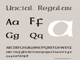
Albertus with a custom descending 'P' and 'G', as it is typical for uncial typefaces.
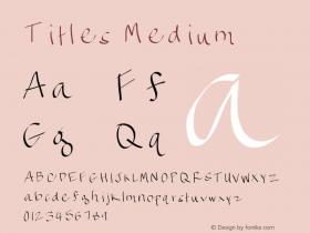
In the 1960s British TV show The Prisoner, an adapted version of Berthold Wolpe'sAlbertuswas used on everything from titles to signs and props. Many of these were hand rendered. The key adaptations were the removal of the dots from 'i's and 'j's, and 'e's that had an uncial feel to them — although occasionally standard 'e's snuck in too. I don't currently know who created all the signs, though the show's art director was a chap called Jack Shampan.

Source: http://www.wemadethis.co.uk.License: Public Domain.

Source: http://www.wemadethis.co.uk.License: Public Domain.

Source: http://www.wemadethis.co.uk.License: Public Domain.

Source: http://www.wemadethis.co.uk.License: Public Domain.

Source: http://www.wemadethis.co.uk.License: Public Domain.


-
 ShanhaiFonts
Brand:山海字库
Area:China

-
 Cangji Fonts
Brand: 仓迹字库
Area: China
-
 JT Foundry
Brand: 翰字铸造
Area: Taiwan, China

-
 Handmadefont
Brand:
Area: Estonia

-
·千图字体
-
 HyFont Studio
Brand: 新美字库
Area: China


- ·The Great Comic Book Heroes, by Jules Feiffer
- ·10 Top Romantic Fonts on Valentine's Day!
- ·Barbe à papa Cotton Candy
- ·20 Houses. A New Residential Landscape exhibition, Wallpaper* Architects Directory
- ·Why Apple Abandoned the World's Most Beloved Typeface?
- ·Moving Hands (Helena Hauff Remix) by The Klinik, official video
- ·Fonts Design of Childhood Memory
- ·Chinese College Student Invents Smog Font
- ·Japanese Typography Writing System
- ·Alphabet Stories by Hermann Zapf