


Moonshine Prints


Source: http://www.moonshineprints.com.Moonshine Prints. License: All Rights Reserved.
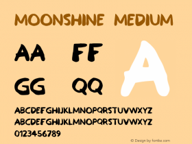
Brevier Vienneseas the primary display face for its relevance to the time period we are concerned with.
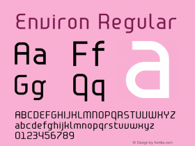
For primary body text we requested David Jonathan Ross to let us use his unreleased typefaceFern. We used the RE (Reading Edge™, a series of typefaces by Font Bureau optimized for reading on small sizes in low resolution environments) version of Fern for both web and print applications.

Source: http://www.moonshineprints.com.Moonshine Prints. License: All Rights Reserved.

Source: http://www.moonshineprints.com.Moonshine Prints. License: All Rights Reserved.

Source: http://www.moonshineprints.com.Moonshine Prints. License: All Rights Reserved.

Source: http://www.moonshineprints.com.Moonshine Prints. License: All Rights Reserved.
The 'M' of Brevier Viennese was slightly modified to arrive at the final logotype.

Source: http://www.moonshineprints.com.Moonshine Prints. License: All Rights Reserved.
Detail of the web typography (actual size)


-
 ShanhaiFonts
Brand:山海字库
Area:China

-
 Cangji Fonts
Brand: 仓迹字库
Area: China
-
 JT Foundry
Brand: 翰字铸造
Area: Taiwan, China

-
 Handmadefont
Brand:
Area: Estonia

-
·千图字体
-
 HyFont Studio
Brand: 新美字库
Area: China


- ·Benetton identity redesign
- ·Fonts Design of Childhood Memory
- ·How to sell your typefaces
- ·Surabaya Beat by Beat Presser, Afterhours Books
- ·New York New York, Jazz St. Louis
- ·47 free tattoo fonts for your body art
- ·Japanese Typography Writing System
- ·Top 100 Fonts.com Web Fonts for May 2016
- ·Alphabet Stories by Hermann Zapf
- ·He Invented a Font to Help People With Dyslexia Read