


Little Failure by Gary Shteyngart


Source: http://www.casualoptimist.com.License: All Rights Reserved.
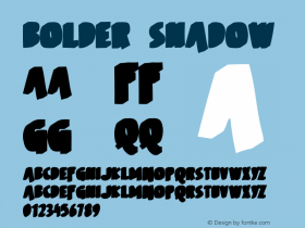
For this new cover, Rodrigo Corral picks up the typeface that he has already used for another Shteyngart book: the energetic brush caps from House Industries'House Brush, there is also a similar, bolder style for the title (unidentified; Avalanche comes close), andSignalistfor the author's name.
Our tools allow us to knead letterforms and bend them into shape, and the result here is not terrible (if you don't look too closely at Signalist's caps and the 'g'). Still, this concept could have been more convincingly realized by a lettering artist, who can create a tailored solution, unencumbered by the constraints of fonts. Type generally works best when used in the way it was designed for: in straight lines, undistorted.
via Casual Optimist's Book Covers of Note November 2014


-
 Cangji Fonts
Brand: 仓迹字库
Area: China

-
 JT Foundry
Brand: 翰字铸造
Area: Taiwan, China

-
 Handmadefont
Brand:
Area: Estonia

-
·千图字体
-
 HyFont Studio
Brand: 新美字库
Area: China
-
 Minrui Type
Brand: 敏锐字库
Area: China


- ·Food Not Bombs hypothetical redesign
- ·Statement and Counter-Statement, Automatically Arranged Alphabets, and Arts/Rats/Star
- ·Japanese Typography Writing System
- ·MC5 – Back in the USA album cover
- ·Alphabet Stories by Hermann Zapf
- ·How to sell your typefaces
- ·Why Apple Abandoned the World's Most Beloved Typeface?
- ·Hollywood Star Matt Damon Wrote Better Chinese than Chinese Stars
- ·The Form Book by Borries Schwesinger
- ·Cocoa Marsh Instant Fudge Candy Mix packaging