


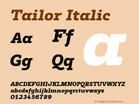
Little Failure by Gary Shteyngart


Source: http://www.casualoptimist.com.License: All Rights Reserved.
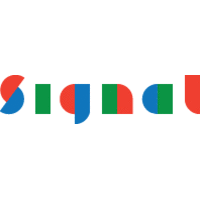
For this new cover, Rodrigo Corral picks up the typeface that he has already used for another Shteyngart book: the energetic brush caps from House Industries'House Brush, there is also a similar, bolder style for the title (unidentified; Avalanche comes close), andSignalistfor the author's name.
Our tools allow us to knead letterforms and bend them into shape, and the result here is not terrible (if you don't look too closely at Signalist's caps and the 'g'). Still, this concept could have been more convincingly realized by a lettering artist, who can create a tailored solution, unencumbered by the constraints of fonts. Type generally works best when used in the way it was designed for: in straight lines, undistorted.
via Casual Optimist's Book Covers of Note November 2014


-
 ShanhaiFonts
Brand:山海字库
Area:China

-
 Cangji Fonts
Brand: 仓迹字库
Area: China
-
 JT Foundry
Brand: 翰字铸造
Area: Taiwan, China

-
 Handmadefont
Brand:
Area: Estonia

-
·千图字体
-
 HyFont Studio
Brand: 新美字库
Area: China


- ·How to Read a Painting by Patrick de Rynck
- ·10 Top Romantic Fonts on Valentine's Day!
- ·Moving Hands (Helena Hauff Remix) by The Klinik, official video
- ·Amazon Releases Ember Bold Font for the Kindle
- ·Ad for Vincebus Eruptum by Blue Cheer
- ·The Future of Sex poster
- ·Hollywood Star Matt Damon Wrote Better Chinese than Chinese Stars
- ·Type terms: the animated typographic cheat sheet
- ·Fonts Design of Childhood Memory
- ·Cocoa Marsh Instant Fudge Candy Mix packaging