


Die verlorenen Welten des Zdenek Burian by Judith Schalansky (ed.)


Source: http://www.matthes-seitz-berlin.de.Matthes & Seitz. License: All Rights Reserved.
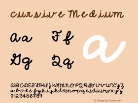
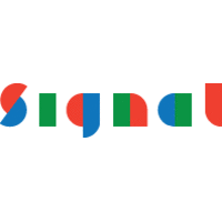
"The Lost Worlds ofSignalistby Saline in particular. Signalist was picked by David Sudweeks for Typographica's Typefaces of 2012. In his review, he wrote:
The texture is just uneven enough to be believable, and yet sufficiently normalized to not draw undue attention to any individual part. And it accomplishes all this with a minimal cast; the face abstains from the present arms race for fully-loaded script fonts, itself containing no alternates or non-standard ligatures.
By and large I agree with this view, but looking at the two mid-word letters 'r' that don't connect from the preceding 'e' and 'o', I wish there were a more cursive solution for this.
Apart from that, it is an admirable cover. Burian's illustration style, the reduced color palette and the material — a coarse cloth — help to evoke an appropriate 1950s/1960s atmosphere. Although colleague Sudweeks regards Signalist "as fully contemporary", I'd argue that the typeface has a hand in this retro vibe as well.


-
 ShanhaiFonts
Brand:山海字库
Area:China

-
 Cangji Fonts
Brand: 仓迹字库
Area: China
-
 JT Foundry
Brand: 翰字铸造
Area: Taiwan, China

-
 Handmadefont
Brand:
Area: Estonia

-
·千图字体
-
 HyFont Studio
Brand: 新美字库
Area: China


- ·New York New York, Jazz St. Louis
- ·Hollywood Star Matt Damon Wrote Better Chinese than Chinese Stars
- ·The Great Comic Book Heroes, by Jules Feiffer
- ·London Underground's iconic Johnston Sans typeface
- ·Quimbaya Coffee Roasters
- ·Chinese College Student Invents Smog Font
- ·Alibaba Supports Font Infringement Complaints
- ·Statement and Counter-Statement, Automatically Arranged Alphabets, and Arts/Rats/Star
- ·Linotype Ad: "Linotype vs. Intertype"
- ·Once Upon DESIGN: New Routes for Arabian Heritage