Local US Telephone Directory


Photo by Peter Dawson. License: All Rights Reserved.
This interior of a San Francisco Bay Area edition of the "white pages" was shot by Peter Dawson who wrote the following for The Field Guide to Typography:
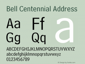
"Commissioned by AT&T to design a replacement for their existing phonebook typeface, Bell Gothic, the brief required a typeface that would provide increased legibility and a saving in the amount of paper used. Carter's solution was to create a condensed sans serif (Bell Centennial) that would work at very small sizes (6 point), thus allowing for more characters to be placed on a single line. This not only stopped the running of addresses on two lines but also negated the need to abbreviate the majority of them, thereby reducing the page extent of the new phonebooks. The smaller extent helped the company save millions of dollars.
With printing a typeface on lightweight and porous newsprint stock at small sizes comes the problem of ink spreading and filling in, and a subsequent drop in character legibility. Carter introduced oversized ink traps into the letterforms, which would fill in and negate the ink spread when printed. At larger sizes, these character traits are very pronounced but when small they are hardly visible."
-
 ShanhaiFonts
Brand:山海字库
Area:China

-
 Cangji Fonts
Brand: 仓迹字库
Area: China

-
 JT Foundry
Brand: 翰字铸造
Area: Taiwan, China

-
 Handmadefont
Brand:
Area: Estonia

-
·千图字体
-
 HyFont Studio
Brand: 新美字库
Area: China

- ·Food Not Bombs hypothetical redesign
- ·How House Industries Designs Its Retrotastic Logos and Typefaces
- ·XUID Arrays: One Less Thing To Worry About
- ·Japanese Typography Writing System
- ·Surabaya Beat by Beat Presser, Afterhours Books
- ·Antropofagia. Palimpsesto Selvagem
- ·Linotype Ad: "Linotype vs. Intertype"
- ·The Great Comic Book Heroes, by Jules Feiffer
- ·Brother Moto Flat-Trackin' Tee
- ·"Fantastic!" ad for Captain Fantastic & the Brown Dirt Cowboy by Elton John & Bernie Taupin


