Sotheby's 2014 Redesign


License: All Rights Reserved.
Pentagram redesigned Sotheby's identity, spearheaded by Abbot Miller. From their extensive post about the design and process:
"Miller's new system establishes a cohesive look and feel across the company's diverse locations and programs. The goal of the redesign was maintaining the image of a modern global brand while also reflecting the heritage of a company that has been in business for almost 300 years. Miller and his team developed a new wordmark (shifting from the previous Gill Sans-based sans serif toMercury) and new design standards for stationery and related print collateral, auction catalogues, Sotheby's magazine, the Sotheby's website and app, advertising and promotions, signage and environmental graphics, and auction ephemera like aprons and bid paddles. The program began rolling out in September with the website, and will continue to influence all Sotheby's communications. […]
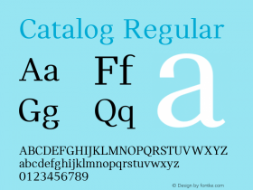
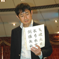
A suite of typefaces ties the system together across various channels. Mercury is the primary typeface, withBenton Sansas the secondary font.FreightDisplayis a tertiary typeface employed for display and headlines. Miller commissioned the acclaimed type designer Akira Kobayashi of Monotype to draw custom Chinese characters for Sotheby's Hong Kong wordmark that would pair gracefully with the Mercury."

License: All Rights Reserved.

License: All Rights Reserved.

License: All Rights Reserved.

License: All Rights Reserved.

License: All Rights Reserved.

License: All Rights Reserved.

License: All Rights Reserved.

License: All Rights Reserved.

License: All Rights Reserved.

License: All Rights Reserved.
-
 ShanhaiFonts
Brand:山海字库
Area:China

-
 Cangji Fonts
Brand: 仓迹字库
Area: China

-
 JT Foundry
Brand: 翰字铸造
Area: Taiwan, China

-
 Handmadefont
Brand:
Area: Estonia

-
·千图字体
-
 HyFont Studio
Brand: 新美字库
Area: China

- ·The Future of Sex poster
- ·How House Industries Designs Its Retrotastic Logos and Typefaces
- ·How to Read a Painting by Patrick de Rynck
- ·Brother Moto Flat-Trackin' Tee
- ·Benetton identity redesign
- ·Amazon Releases Ember Bold Font for the Kindle
- ·Make market-ready fonts with this 8 point checklist
- ·Japanese Typography Writing System
- ·XUID Arrays: One Less Thing To Worry About
- ·Statement and Counter-Statement, Automatically Arranged Alphabets, and Arts/Rats/Star


