


German Government Style Guide


Source: http://www.flickr.com.Uploaded to Flickr by Pool Albert-Jan and tagged with "demos" and "praxis". License: All Rights Reserved.
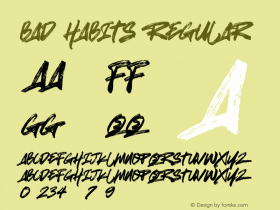
Stealing sheep by design.
A few years ago, the corporate design guidelines of the German ministries suggested letterspacing lowercase letters as a means to emphasize words. In Germany letterspacing used to be a traditional way of emphasis within texts that were set in Textura, Schwabacher or Fraktur because these typestyles usually do not have corresponding italic styles*. The corporate design manual specifies Gerard Unger's typefacesDemosandPraxis. Although Demos has an italic style which is suitable to be used for emphasizing, the designers fell back to the "bad habits" of their typographic past.
*Fraktur is in fact a cursive Textura, but Fraktur does not differ enough from Textura in order to use it for typographic emphasis in a text set in Textura. Even for German readers, the capitals of Textura and Fraktur were not legible enough to allow for all caps setting, so emphasis using all caps was not an option. Using bold styles as means of emphasis never really caught on either.


-
 ShanhaiFonts
Brand:山海字库
Area:China

-
 Cangji Fonts
Brand: 仓迹字库
Area: China
-
 JT Foundry
Brand: 翰字铸造
Area: Taiwan, China

-
 Handmadefont
Brand:
Area: Estonia

-
·千图字体
-
 HyFont Studio
Brand: 新美字库
Area: China


- ·The Future of Sex poster
- ·How House Industries Designs Its Retrotastic Logos and Typefaces
- ·How to Read a Painting by Patrick de Rynck
- ·Brother Moto Flat-Trackin' Tee
- ·Benetton identity redesign
- ·Amazon Releases Ember Bold Font for the Kindle
- ·Make market-ready fonts with this 8 point checklist
- ·Japanese Typography Writing System
- ·XUID Arrays: One Less Thing To Worry About
- ·Statement and Counter-Statement, Automatically Arranged Alphabets, and Arts/Rats/Star