


Henriette for NYTimes.com


Source: http://www.flickr.com.Uploaded to Flickr by Stephen Coles and tagged with "henriette". License: CC BY-NC-SA.
A New York Times article on Austrian real estate re-set entirely in Henriette.
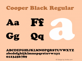
Like Hochleitner's Ingeborg, Henriette is a design so full of character at first glance that most folks will place it firmly in the category of display type, overlooking it as a text option. But it sets quite sober, readable text.
The only thing that makes me shy away is that the italics are noticeably lighter in color than their roman companions. This may not bother others, but I like my italic to be the same general weight or the emphasis is too stark. Still, what a lovely page this makes! Note the Black weight (a sophisticated Souvenir or Cooper Black) at the top and the Compressed in the sidebar.
… … … … … … … … … … … … … … … …
Fun with webfont swapping. Tools: FontShop's WebFonter and Webtype's Fontswapper.


-
 ShanhaiFonts
Brand:山海字库
Area:China

-
 Cangji Fonts
Brand: 仓迹字库
Area: China
-
 JT Foundry
Brand: 翰字铸造
Area: Taiwan, China

-
 Handmadefont
Brand:
Area: Estonia

-
·千图字体
-
 HyFont Studio
Brand: 新美字库
Area: China


- ·Quimbaya Coffee Roasters
- ·20 Houses. A New Residential Landscape exhibition, Wallpaper* Architects Directory
- ·Food Not Bombs hypothetical redesign
- ·Benetton identity redesign
- ·Make market-ready fonts with this 8 point checklist
- ·Cocoa Marsh Instant Fudge Candy Mix packaging
- ·How House Industries Designs Its Retrotastic Logos and Typefaces
- ·Fonts Design of Childhood Memory
- ·Alibaba Supports Font Infringement Complaints
- ·Alphabet Stories by Hermann Zapf