


Läckerli Huus


Source: http://www.flickr.com.Uploaded to Flickr by Florian Hardwig and tagged with "fettefraktur". License: All Rights Reserved.
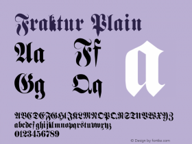
Nina posted this on Twittter before: The new owner of Basel-based confectionery Läckerli-Huus apparently found the Fraktur 'H' unacceptable. It got replaced with a dumb and unskilled hybrid form in the new logo. The 's' lost its fine top swash, and the 'l' was messed with, too. Also, the (double) hyphen had to go.
This is not the first time that blackletter peculiarities were sacrificed: In the 1990s, the logo still proudly featured a 'ck' ligature. When the ligature was dissolved, the new 'k' kept its very tiny and high loop – and got an enormous leg.
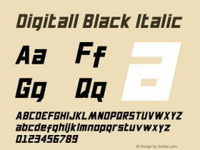
All logo versions are related to the model ofFette Fraktur. The newest one is derived directly from a digitally available font. By the way, Linotype's Fette Fraktur has the "latinized" 'k' as included in the Läckerli Huus logo, while URW++ and E+F offer the font with the original Fraktur 'k'.

Source: http://www.flickr.com.Pete Shacky. License: All Rights Reserved.

Source: http://www.flickr.com.Julio César Cerletti García. License: CC BY-NC-ND.


-
 ShanhaiFonts
Brand:山海字库
Area:China

-
 Cangji Fonts
Brand: 仓迹字库
Area: China
-
 JT Foundry
Brand: 翰字铸造
Area: Taiwan, China

-
 Handmadefont
Brand:
Area: Estonia

-
·千图字体
-
 HyFont Studio
Brand: 新美字库
Area: China


- ·"Die Alpen – Vielfalt in Europa" stamp
- ·How House Industries Designs Its Retrotastic Logos and Typefaces
- ·47 free tattoo fonts for your body art
- ·Alphabet Stories by Hermann Zapf
- ·Jim Nutt: Coming Into Character at Museum of Contemporary Art Chicago
- ·The Future of Sex poster
- ·10 Top Romantic Fonts on Valentine's Day!
- ·New York New York, Jazz St. Louis
- ·Bevésett nevek (Carved Names), vol. 2
- ·Barbe à papa Cotton Candy