


Fontke.com>Article>Details
Wacken Open Air Logo
IntroductionSource: http://www.wacken.com.License: All Rights Reserved.Framed


Source: http://www.wacken.com.License: All Rights Reserved.
Framed with skulls, the giant Wacken logo made of steel welcomes the visitors at the festival venue.
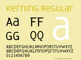
And yes, of course the kerning is wack.
LatinWide or whether they used CastleType's Latin CT Not Wide. The Wacken folks certainly weren't shy about squeezing type until it fits.

Source: http://www.wacken.com.License: All Rights Reserved.

Source: http://img.earafour.de.License: All Rights Reserved.
Relevant font family


Relevant font foundry
Wacken Open Air Logo Comments
Wacken Open Air Logo Latest comments
No relevant comments
-
 Cangji Fonts
Brand: 仓迹字库
Area: China

-
 JT Foundry
Brand: 翰字铸造
Area: Taiwan, China

-
 Handmadefont
Brand:
Area: Estonia

-
·千图字体
-
 HyFont Studio
Brand: 新美字库
Area: China
-
 Minrui Type
Brand: 敏锐字库
Area: China


Recommended font article
- ·Iconic Transport for London logo undergoes subtle redesign
- ·Linotype Ad: "Linotype vs. Intertype"
- ·Benetton identity redesign
- ·The Future of Sex poster
- ·Alphabet Stories by Hermann Zapf
- ·London Underground's iconic Johnston Sans typeface
- ·How House Industries Designs Its Retrotastic Logos and Typefaces
- ·10 Top Romantic Fonts on Valentine's Day!
- ·Quimbaya Coffee Roasters
- ·XUID Arrays: One Less Thing To Worry About