An Interview with Zuzana Licko
Zuzana Licko co-founded Emigre — one of the first independent digital type foundries — in 1984. This interview with Licko was conducted on the eve of Emigre's 15th anniversary in 1998.
How do you get ideas for new typeface designs?
Most of my inspiration comes from the particular medium that I'm involved with at the time. I search out a problem that needs to be addressed or a unique result that a production method can yield.
For example, my interest in making type was initiated by my need for unique and more effective fonts than those originally available for the Macintosh computer screen and dot matrix printer in 1984. As graphic designers, we also enjoyed the new found ability to test and implement the faces directly within our design work. Initially I was designing typefaces exclusively for use in Emigre magazine, but as other designers expressed interest in using them as well, we formed Emigre Font in 1986.
Although my first type designs were in the form of bitmap fonts for use on dot matrix printers, after the introduction of high resolution PostScript outline technology I developed several high resolution designs based upon my earlier bitmaps.
I have revisited some of these early bitmap ideas with my Base 9 and Base 12 font designs. The Base families offer compatible screen and printer fonts to solve today's dual need of low resolution screen display and high resolution printing with an integrated typeface design.
My latest interest in creating somewhat more traditional text faces is a result of Emigre magazine's increased publishing of in-depth articles, which require type designs appropriate for lengthy text setting. My Baskerville revival, named Mrs Eaves, presented me with the opportunity to design some fanciful ligatures which help create visual interest and are reminiscent of customized lettering.
How do you judge the validity of a new or experimental typeface design?
Design is about creating something new each time we approach a problem, even if it's the same problem. Over time different solutions are required to address the same design problem because the context changes over time and results in shifting of meaning. Thus, the "same old solution" tends to become boring over time and leads the audience to lose interest.
In addition, new technologies and environments arise to present new problems for the designer to address. The most successful experimental typeface designs are often those that address the needs of a new, yet unchartered, technology.
What is the biggest obstacle in typeface design?
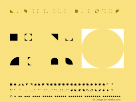
The lack of legal protection from piracy is a great problem. Although this is not specifically a design problem, it spurred me to design the Hypnopaedia pattern illustrations which use letter designs as texture. It had become obvious to me that most people find it difficult to comprehend letters as abstract shapes. Unfortunately, it is this inability to distinguish between the ornamental design of letter forms and the alphabetic characters they represent, which has resulted in the lack of U.S. copyright protection for letter form designs. It occurred to me that taking letter forms out of their usual context of alphabetic word composition would illustrate that letter form designs have value as independent forms, separate and distinct from their ability to represent alphabetic characters. When applied within the context of pattern elements, the stylistic messages of letter designs are allowed to surface.
Letter forms are constructed as shapes of positive space but of equal importance to their recognizability as representations of alphabetic characters is their enclosure of negative space, as well as the white space that separates letters from one another to facilitate the recognition of words. Within the Hypnopaedia pattern elements, on the other hand, the negative spaces of the original letter forms are altered by rotation and by the positioning or interlocking of adjacent shapes.
When viewing two different letter designs of the alphabetic character "A," people tend to focus on the similarities between the two "A"s as they both represent the character "A." Some people might even express difficulty in distinguishing between the two "A"s altogether. Within the context of these patterns, however, it is clear that the patterns created from various "A" designs, for example, are in fact each distinct and separate in visual meaning.
Each of the resulting Hypnopaedia pattern illustrations was created by concentric rotation of a single letter form from the Emigre Fonts library. When repeated, each Hypnopaedia illustration creates a unique pattern of interlocking letter shapes. An infinite variety of patterns can be composed by combining and alternating the basic 140 Hypnopaedia illustrations.
What impact has the personal computer, specifically the Macintosh, had on design?
The personal computer has democratized design. It has given virtually equal design opportunities to lay people and design professionals alike.
Before the personal computer, most people were limited to the typewriter as a personal means of communicating the printed word. The design limitations were similar to today's email; one monospaced font without pictures. It is debatable, however, whether lay people are better able to communicate with today's choices than they were with the typewriter. Although having an abundance of graphic options and font choices can increase communicative power when used effectively, if used without understanding, communication can actually be impaired as the message can drown in confusion.
Just like the ability to calculate the tangent with a calculator does not bring the user any closer to understanding the inner workings of geometry, the latest desktop publishing applications will not bring the lay person any closer to understanding the inner workings of design. But it gives the illusion of doing so.
As we go forward with ever increasing speed to faster and more powerful computing which will offer us an ever growing number of choices, it will be crucial for designers to become ever more knowledgeable about selecting the most appropriate choices from an increasing availability.
What is your opinion about "cut & paste" or modified fonts?
The cut & paste phenomenon of font generation has become very popular, mainly because it's a new found toy. Fonts have become popular because suddenly everybody has the capability of installing a custom selection of fonts to their personal computer. With this same computer anyone who chooses to can also install a font making program, and this has resulted in an increased interest in the making of fonts as well. The fact is, however, that most never get beyond tinkering with existing fonts because the design and manufacture of an original typeface is an incredible amount of work, which requires quite a bit of devotion to master. Of course, there is nothing wrong with experimentation and the customizing of fonts for private use, as long as the user has acquired a legal copy of the font they are experimenting with. The problem comes about when such products are distributed without compensation to, and without proper credit to, their originators. Improper proliferation of these fonts serves to confuse the already obscure history of type.
Since type design has been a very exclusive field until recently, there is little information available as compared to other design disciplines. Often, people tend to forget that typefaces are in fact designed and not merely static forms handed down from generation to generation. One of the frustrations is that credits for typefaces are usually missing from design pieces. Although a design project usually credits the work of the graphic designers, art directors, photographers, illustrators and even printers, seldom are the fonts or type designers mentioned, although the typeface(s) used may constitute a great portion of the resulting work.
Are revivals the next trend for serious type designers?
I can't speak for all serious type designers, but my own interest for reviving the classics was sparked by two factors; the sophistication of today's personal computer and the current content of Emigre magazine shifting towards more theory and text.
The original restraints that the personal computer put on type design (which made it so exciting for me in 1984) have disappeared within the standard graphic design environment. Of course they persist in low resolution environments, but the designer's personal computer tools today have plenty of power to render a limitless variety of forms.
The other and more important factor is that my typeface designs remain closely linked to their use in Emigre magazine. Since Emigre magazine currently tends to contain more critical writing and less visual material, it was only natural to develop more text faces, and revivals were a good place to start; a means of getting back to basics.
What is your outlook for type design in the 21th Century?
Information is increasingly being stored, accessed and displayed in digital form. Thus, on-screen design has regained importance for multimedia CDs, electronic bulletin boards and the World Wide Web. Screen display is no longer a temporary analogy for the final printed piece; it has become the final method of viewing much of our information. This presents the challenge of addressing the coarse resolution of the common computer screen.
Meanwhile, the primary function of type remains communication and communication is becoming a basic need in our culture. In order to understand one another, human beings require an order to information; from the layout of the page to the shape of the letters, to the grammar of the text. Cut & paste, popularized as the "grunge" movement, "destroyed" typefaces and typography and do not communicate much more than the image of destruction. I believe this to be a reflection of our society's desperation about the vast technological changes which are taking away our familiar comforts of more traditional means of communication. As efficient exchange of information becomes a requirement in tomorrow's information age, it stands to reason that a sophisticated, highly ordered means of typographic expression will be adopted instead.
-
 ShanhaiFonts
Brand:山海字库
Area:China

-
 Cangji Fonts
Brand: 仓迹字库
Area: China

-
 JT Foundry
Brand: 翰字铸造
Area: Taiwan, China

-
 Handmadefont
Brand:
Area: Estonia

-
·千图字体
-
 HyFont Studio
Brand: 新美字库
Area: China

- ·Antropofagia. Palimpsesto Selvagem
- ·How House Industries Designs Its Retrotastic Logos and Typefaces
- ·XUID Arrays: One Less Thing To Worry About
- ·How to Read a Painting by Patrick de Rynck
- ·Moving Hands (Helena Hauff Remix) by The Klinik, official video
- ·Königsblut identity
- ·Jim Nutt: Coming Into Character at Museum of Contemporary Art Chicago
- ·Once Upon DESIGN: New Routes for Arabian Heritage
- ·"Jesus Music" ad for Myrrh Records
- ·10 Top Romantic Fonts on Valentine's Day!


