


Back To The Eighties With Justice's DVNO

It's a disease. No really, I mean it. Whenever we see faces – typefaces that is – we feel compelled to identify them. Whatever the situation or the context. I suspect it must be some obsessive compulsive need to bring order to the world, to register and classify and arrange. It's far from a fatal disease, but it may sometimes impede on one's social skills. And on one's concentration while reading. I used the plural "we" because fortunately I am not alone.
It's Stephen Coles – my Typophile Film Fest.
23:47:37Yves Peters:Now I'm trying to get the Frenchies who did D.A.N.C.E. and DVNO by Justice, and the Kanye West graffiti clip.
23:47:50Stephen Coles:DVNO we should ID all those fonts.
23:48:08Stephen Coles:Someone did the TV intros they mimicked, so we do the fonts now.
Yep, he said it. So I had to get to it sooner or later. Because he once devoted an amazing Typographica entry to the typefaces used in Shadowplay's fabulous opening title credits for Thank You For Smoking. Because expatriate compatriot Steven Van Vaerenbergh already identified most of the eighties old-skool CGI television bumpers the video is based upon. And because it's a dirty job, but somebody's gotta do it.
Justice – DVNO from Freedom Record on Vimeo.
Above is the smashing video by So Me and Machine Molle; an insane collage of (seemingly) vintage animated eighties logos. If you want to find out more about its back story read the interview with Justice on Much Music. There's also an article on So Me on the Mass Appeal website.

This – obviously – is the Ed Banger Records logo, the label that releases Justice. No real reference to any other known logo I know of, but it certainly looks the part. The sans is the original Kabel with a customised "g", and the script underneath is a typical "baseball" script like Casey.

A clear reference to the classic 1980s Channel 4 colour blocks ident, these letters have no equivalent in type, though Julian Morey of Club-21 has explored similar forms.

There are quite a few similar fonts that are constructed out of dots on a grid (or squares on a grid).

The jury is still out whether this one is inspired by Reading Rainbow or the NBC peacock, or maybe both. The typeface is ITC Serif Gothic.

No type to be seen, just an eye, but who could miss the 2001: A Space Odyssey reference? HAL 9000: "I'm sorry Dave, I'm afraid I can't do that."

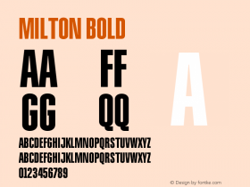
This type and its arrangement are very similar to The Gong Show logo, whose typeface is one of these extreme bold display faces. It reminds me of Milton Glaser's classic geometric constructed Baby Teeth (interpreted by ParaType as Bebit), but it is quite possibly custom drawn.

FontFeed reader Mike pointed out the similarity with the Blade Runner logo, while fuldog recognised the ESPN logo. No matching typeface (both logos look custom designed), but Rian Hughes' Interceptor is very similar in style.

It's a little difficult to make out but I'm confident the serif open face used for Membership is Viva, strictly speaking an anachronism.

Young & Old? Helvetica.

And Helvetica once more. I'm pretty sure the PBS inspired logo is custom drawn.

This is genuine classic eighties style. It has everything: the explosion, the flying 3D logo, the canyon mirrored in the macho letter shapes, and sparkling outlines. Although I couldn't find an equivalent in type, ITC Pioneer No. 2 conveys the same feeling.

This one nicely displays the pros and cons of tightly spacing and stacking Eurostile Extended.


This complete sequence is a beautiful take on the HBO 1983 ident. The first logo could be anything, ranging from Helvetica to Futura. I don't know which typeface the end logo is. FF Motel Gothic has most of the character shapes right but feels too Art Deco, while Borgstrand is too heavy.

Although this striped version doesn't exist, those typical extra bold letter forms with sharp corners are actually Eagle.

It's not as elaborate, but the multilinear display face Dublon follows the same basic concept.

Sweat is custom designed to look like the Sega logo…

… and the horizontals stripes at each side of Belt mimic the Top Gun logo. The character shapes of Gran Turismo Extended come quite close.

Cool is designed to look like the Audi logo.

The original lettering in the Universal Studios Florida logo was replaced with Kaufmann, and Block Up, an outrageous 3D display face designed by Sally Ann Grover and released by Letraset in the late seventies.

The capital P of Plaza was paired with the lowercase of Dynamo.

I found a number of examples with an open "C" like this one in the Compact Sans Serifs FontList, but none of them has that characteristic bounce.

A similar type of slanted capitals designed for perfect fit in headlines are included in ITC Avant Garde Gothic Pro, the feature-rich OpenType version which has all the alternate characters and ligatures built in.

Not really type, yet the stripped down skeleton of the characters has a lot in common with FF Netto.

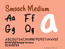
Casual caps written in lipstick. Smoochalicious…

This one is interesting – the characters are fearfully close to Space, a former member of the Star Trek pack that was discontinued by Bitstream. The typefaces however are still available as the single fonts Horizon, Galaxy, Millenium, and Sonic. Crillee Italic and Handel Gothic were also seen in the television series and movies.

Those military-style angular caps against the setting sun are reminiscent of the Hollywood sign. They are set in ITC Machine.

Another faithful adaptation – in this case of the Cannon Films ident. The caps below are set in ITC Avant Garde Gothic Pro.

This clearly is an homage to Twentieth Century Fox. There are similar extremely black display faces with linear counters available – for example FF Extra and Alpha Bloc Sculpture – however these characters look custom designed.

A faithful interpretation of the CBS/Fox Video ident, with custom striped Helvetica Inserat for the letters.

And last but not least, a very successful satire on the paper "C" in Stephen J. Cannell Productions which came at the end of the A-Team episodes. The multilinear character is custom designed of course.
This is about it. If you spot any mistake or are able to fill in a blank let me know.
I'd like to extend my thanks to Jonathan Hoefler for being one of the first to make me aware of this video last year – so he had a part in this article as well –, and more importantly for pointing me to Steven Van Vaerenbergh's research on the eighties television logos and idents.
Header image:Justice cross logo, inspired by Michael and Friends.


-
 ShanhaiFonts
Brand:山海字库
Area:China

-
 Cangji Fonts
Brand: 仓迹字库
Area: China
-
 JT Foundry
Brand: 翰字铸造
Area: Taiwan, China

-
 Handmadefont
Brand:
Area: Estonia

-
·千图字体
-
 HyFont Studio
Brand: 新美字库
Area: China


- ·New York New York, Jazz St. Louis
- ·10 Top Romantic Fonts on Valentine's Day!
- ·Benetton identity redesign
- ·Ad for Hello Dummy! by Don Rickles
- ·Japanese Typography Writing System
- ·Ad for Vincebus Eruptum by Blue Cheer
- ·How to sell your typefaces
- ·"Die Alpen – Vielfalt in Europa" stamp
- ·Alphabet Stories by Hermann Zapf
- ·Cher Got Sued For Font!