


Rappold Köhli Website


Source: http://rappoldkoehli.ch.License: All Rights Reserved.
Type-centric website for a newly founded law firm in Zurich – via @grillitype.
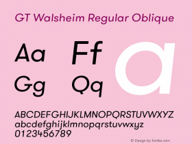
In the logo with the outlinedGT Walsheim, the bar of the A has been shifted down to the next line, where it stands in for the two dots of the umlaut in "Köhli". Such a macron-like diaeresis is particularly popular in Switzerland – cf. "Swiss umlauts" on Flickr.
The (regular) umlaut in the last image of this post is interesting, too. It is a textbook example why it sometimes would be nice to have fonts with more compact diacritics: In many languages, lines with caps (and especially lines in all-caps) can't be set solid because umlauts and accents get in the way. I have discussed both of these topics – fancy decorative umlauts and useful compact umlauts – in my article for the freshly published fourth issue of TypoJournal (in German).

Source: http://rappoldkoehli.ch.License: All Rights Reserved.

Source: http://rappoldkoehli.ch.License: All Rights Reserved.

Source: http://rappoldkoehli.ch.License: All Rights Reserved.


-
 ShanhaiFonts
Brand:山海字库
Area:China

-
 Cangji Fonts
Brand: 仓迹字库
Area: China
-
 JT Foundry
Brand: 翰字铸造
Area: Taiwan, China

-
 Handmadefont
Brand:
Area: Estonia

-
·千图字体
-
 HyFont Studio
Brand: 新美字库
Area: China


- ·Top 100 Fonts.com Web Fonts for May 2016
- ·How to sell your typefaces
- ·Quimbaya Coffee Roasters
- ·47 free tattoo fonts for your body art
- ·Statement and Counter-Statement, Automatically Arranged Alphabets, and Arts/Rats/Star
- ·Alphabet Stories by Hermann Zapf
- ·Moving Hands (Helena Hauff Remix) by The Klinik, official video
- ·Cher Got Sued For Font!
- ·Brother Moto Flat-Trackin' Tee
- ·Chinese College Student Invents Smog Font