


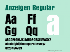
Mugison Mugiboogie Tour Poster


Source: http://www.zwoelf.net.Zwölf. License: All Rights Reserved.
Poster for selected shows of the manic Icelander in Germany. Client: 2fortheroad Booking Agency.
The type looks like Rudolf Koch's Deutsche Anzeigenschrift, originally published by D. Stempel AG. The "Schmal" (Narrow or Condensed) has been revived by Dieter Steffmann and Ralph M. Unger. Delbanco has the "Breit" (Wide), while Gerhard Helzel offers two weights, Breit and Schmal. Very likely, none of those digitizations were employed in the making of this poster. The letters used here are probably derived directly from a historic source and could be based on the "Eng" (Compressed). The 's' is clearly different, though. It probably was customized because the original form doesn't lend itself to being cut in half horizontally.


-
 ShanhaiFonts
Brand:山海字库
Area:China

-
 Cangji Fonts
Brand: 仓迹字库
Area: China
-
 JT Foundry
Brand: 翰字铸造
Area: Taiwan, China

-
 Handmadefont
Brand:
Area: Estonia

-
·千图字体
-
 HyFont Studio
Brand: 新美字库
Area: China


- ·Moving Hands (Helena Hauff Remix) by The Klinik, official video
- ·New York New York, Jazz St. Louis
- ·Why Apple Abandoned the World's Most Beloved Typeface?
- ·Food Not Bombs hypothetical redesign
- ·10 Top Romantic Fonts on Valentine's Day!
- ·Surabaya Beat by Beat Presser, Afterhours Books
- ·Make market-ready fonts with this 8 point checklist
- ·"Jesus Music" ad for Myrrh Records
- ·"David Bowie is turning us all into voyeurs" button
- ·20 Houses. A New Residential Landscape exhibition, Wallpaper* Architects Directory