


Fontke.com>Article>Details
The First Four Notes by Matthew Guerrieri
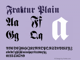
IntroductionLicense: All Rights Reserved.Humboldt is Dieter Steffmann's sligh


License: All Rights Reserved.
Humboldt is Dieter Steffmann's slightly blurry take on a 1930s Fraktur. There are better and probably less anachronistic blackletter fonts available, but Humboldt is ok, and the simple arrangement referencing the opening notes of the 5th Symphony is a nice touch. Too bad about the straight quote.
Relevant font family


Relevant font foundry

The First Four Notes by Matthew Guerrieri Comments
The First Four Notes by Matthew Guerrieri Latest comments
No relevant comments
-
 ShanhaiFonts
Brand:山海字库
Area:China

-
 Cangji Fonts
Brand: 仓迹字库
Area: China
-
 JT Foundry
Brand: 翰字铸造
Area: Taiwan, China

-
 Handmadefont
Brand:
Area: Estonia

-
·千图字体
-
 HyFont Studio
Brand: 新美字库
Area: China


Recommended font article
- ·How House Industries Designs Its Retrotastic Logos and Typefaces
- ·Fonts Design of Childhood Memory
- ·Ad for Hello Dummy! by Don Rickles
- ·London Underground's iconic Johnston Sans typeface
- ·He Invented a Font to Help People With Dyslexia Read
- ·Cocoa Marsh Instant Fudge Candy Mix packaging
- ·MC5 – Back in the USA album cover
- ·Make market-ready fonts with this 8 point checklist
- ·Iconic Transport for London logo undergoes subtle redesign
- ·Ad for Vincebus Eruptum by Blue Cheer