


A List Apart 5.0


Source: http://alistapart.com.©Copyright A List Apart 2013. License: All Rights Reserved.
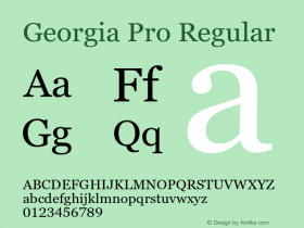
As Jason Santa Maria departs from A List Apart, so does his design from 2005. ALA has a bold new look and is now responsive. Although Mike Pick & Tim Murtaugh are cited as the designers, Zeldman's love forFranklinis unabashed:
[W]e set the body type in good old classic Georgia. (Our Georgia Pro and ITC Franklin are both courtesy of the wizards at Webtype. If it's wrong to be in love with two web fonts, I don't want to be right.)
Although Zeldman has been testing the pairing on his personal site, Mike & Tim struck a more appropriate tone on ALA. With Georgia Pro replacing Verdana in the body, the urge to read it later is suppressed. Franklin doubles as a bold headliner and a superb metadata face, only showing imperfections at sizes below 14px.

Source: http://alistapart.com.©Copyright A List Apart 2013. License: All Rights Reserved.


-
 ShanhaiFonts
Brand:山海字库
Area:China

-
 Cangji Fonts
Brand: 仓迹字库
Area: China
-
 JT Foundry
Brand: 翰字铸造
Area: Taiwan, China

-
 Handmadefont
Brand:
Area: Estonia

-
·千图字体
-
 HyFont Studio
Brand: 新美字库
Area: China


- ·He Invented a Font to Help People With Dyslexia Read
- ·Alphabet Stories by Hermann Zapf
- ·20 Houses. A New Residential Landscape exhibition, Wallpaper* Architects Directory
- ·Type terms: the animated typographic cheat sheet
- ·Jim Nutt: Coming Into Character at Museum of Contemporary Art Chicago
- ·London Underground's iconic Johnston Sans typeface
- ·Amazon Releases Ember Bold Font for the Kindle
- ·Hollywood Star Matt Damon Wrote Better Chinese than Chinese Stars
- ·Troubadour poster, Opera Plovdiv
- ·Cocoa Marsh Instant Fudge Candy Mix packaging