


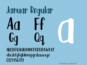
Avenir Next Rounded: Legible, Versatile — and Personable
Rounded sans serif typefaces carry the authority and clarity of typical sans – and add a sense of approachability. They are not "cute" – but they are amiable. Rounded sans also maintain all the legibility of their more traditionally designed brethren while being more personable.

Sans serif typefaces have been the mainstay for branding, signage, wayfinding, and advertising for well over a century. While the story is told that early designs were called "grotesques" because they were perceived as, well, ugly; sans serifs have firmly established themselves in the typographic pantheon as straightforward, no-nonsense graphic communicators. Recently, however, rounded sans have become popular alternatives as more friendly – more human – typographic spokespeople. Everything from logos to ad campaigns have benefited from these affable designs.
Creating a rounded sans serif typeface, however, is not an easy task. It entails much more than rounding off the edges of stroke terminals. In some instances stroke lengths must be lengthened to look correct, while in other cases they must be shortened for the same reason. Small parts of characters, like the ear of a 'g' or flag of an 'r,' may also need to be adjusted. The list goes on.
Designed by Akira Kobayashi, Avenir Next Rounded is the third generation of Adrian Frutiger's Avenir typeface. Although a consistently popular and exceptionally versatile design, Kobayashi saw the potential for a new, softer interpretation of the Avenir Next characters. The rounded terminals he incorporated into the design infuse it with a more complex – and genial – quality. Kobayashi has maintained the modified geometric structure of Frutiger's original design, and added to it a softness that transforms the typeface.
As an additional benefit, you can save over 75% on the entire Avenir Next Rounded family until January 15th. Be one of the first 1000 customers to purchase and you can get the entire Avenir Next Rounded for only $99. Make sure to take advantage of this promotion before it expires or sells out!

Allan Haley is Director of Words & Letters at Monotype Imaging. Here he is responsible for strategic planning and creative implementation of just about everything related to typeface designs.


-
 ShanhaiFonts
Brand:山海字库
Area:China

-
 Cangji Fonts
Brand: 仓迹字库
Area: China
-
 JT Foundry
Brand: 翰字铸造
Area: Taiwan, China

-
 Handmadefont
Brand:
Area: Estonia

-
·千图字体
-
 HyFont Studio
Brand: 新美字库
Area: China


- ·"Die Alpen – Vielfalt in Europa" stamp
- ·How House Industries Designs Its Retrotastic Logos and Typefaces
- ·47 free tattoo fonts for your body art
- ·Alphabet Stories by Hermann Zapf
- ·Jim Nutt: Coming Into Character at Museum of Contemporary Art Chicago
- ·The Future of Sex poster
- ·10 Top Romantic Fonts on Valentine's Day!
- ·New York New York, Jazz St. Louis
- ·Bevésett nevek (Carved Names), vol. 2
- ·Barbe à papa Cotton Candy