


-
"Origins of Common UI Symbols", Shuffle Magazine Edition
 Source: https://readymag.com.Text originally published by Bryan G
 -
Designers Explain Why Apple's New OS X Typeface Is a Strange Choice
It was one of the more subtle changes showcased during yesterday'
-
Creative trends 2012: A year of creative change and excellence
 Say what you like about 2011: it certainly wasn't boring. While e
 -
Early Bird Registration Extended For TypeCon "Capitolized"
 One of the main typography conferences, TypeCon, presented by SOT
 -
Font tips: Printing type samples
When choosing a typeface to use for a project, there is no replac
-
Earn Commissions for Referring Fonts.com Web Fonts Subscriptions
 We've received an outpouring of excitement since introducing our
 -
7 WordPress plugins to improve your blog's typography
Out of the box, WordPress doesn't come with any typographic tools
-
Digital Ads Are Ready for Web Fonts-We've Got You Covered
 In recent months, we've been excited to see more digital ads usin
 -
 Source: https://www.flickr.com.Jeffrey S. on Flickr. License: All
 -
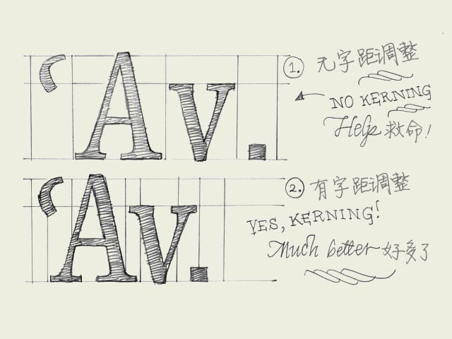 Kerning. Knowledge about kerning will give a deeper understanding of type. However, forget about kerning for now, spend your time on other things. It's much more important to properly space your characters.字距调整的知识会让你对字体的理解更进一步。
- Mobile
- Service
-
Navigation
- Channels
- Clients