


-
DEADLINE APPROACHING: D&AD Awards 2010
The deadline for entries to the D&AD Awards is in one week's time
-
Guide des chefs d'œuvre en péril by Pierre de Lagarde, 1967 Jean-Jacques Pauvert Edition
 Source: http://www.flickr.com.Alexis Orloff. License: All Rights
 -
FF Seria Arabic, The First Arabic FontFont
 The first Arabic typeface in the FontFont library, Pascal Zoghbi'
 -
 When the FontFeed featured a brief review of "Typography for Lawy
 -
Details About The New AFDKO Version…
As I wrote earlier today on our sibling blog, Typblography, a new
-
'World's Most Sustainable Font' Wants To Save The World Through Typography
 Typography is a powerful invention. It is, after all, the design
 -
U&lc Volume Three & Hermann Zapf
 After a 10-year hiatus, Hermann Zapf began designing typefaces ag
 -
 "Familienmacher" (Family Maker) was an exhibition held at the Aus
 -
 U&lc ceased print publication in the fall of 1999. Over its almos
 -
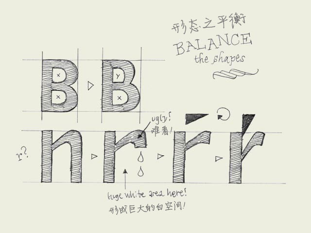 Balance shapes. If you make both of the inner forms (counters) of the 'B' exactly the same, the top counter will optically look bigger. Your character will look plumby, like it's falling down. If you make the top counter smaller than the bottom one,
- Mobile
- Service
-
Navigation
- Channels
- Clients