


-
 For a few days after TYPO Berlin 2011 "Shift" I was still riding
 -
Azuro – A New Typeface For Reading On Screens
 Axel, an economical, highly legible font family optimized for on-
 -
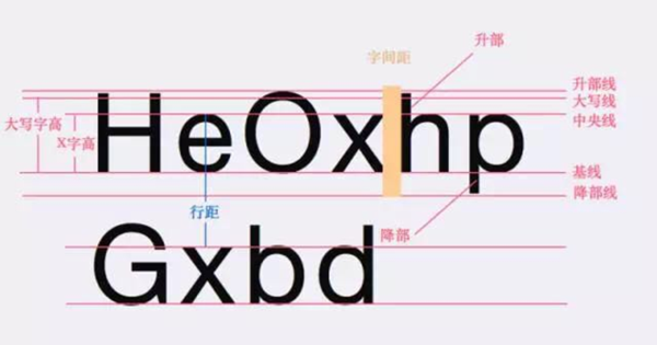 字体&排版学UI的同学都知道,无论做网页还是App设计,文字内容总是能占到整个版面将近80%的区域,所以说,理解字体与排版对UI设计师来说非常关键,你需要始终把内容的可读性放在首位去考虑,从而权衡你对字体与排版的选择。01、字体的基础术语了解字体设计的基础术语非常重要,这些术语在介绍字体设计的相关文章中经常出现。比如 x-height(X字高)指的是从字母的基准线开始往上到最矮字母的顶端的距离,当X字高的比例相对...
 -
ScreenFonts: From Paris With Love, The Wolfman, Ghostwriter, The Crazies, Cop Out, A Prophet
 Oy vey, ridiculously late episode. This time the extensive TDC2 p
 -
 The July 2010 episode of My Type of Music is a little early, beca
 -
 My busy half year is about to kick in high gear. The first of my
 -
Celebrating 20 Years of FontShop With Joan Spiekermann
 This year marks the twentieth anniversary of FontShop. To celeb
 -
Brim Narrow – making a chromatic typeface
Brim Narrow is chromatic typeface. It has eight type styles, desi
-
ScreenFonts: Grand Budapest Hotel, 300: Rise of an Empire, Enemy, Muppets Most Wanted, Nymphomaniac
 When my brother and sister and I were young, we always had impass
 -
A Firm Turn Toward the Objective: Josef Müller-Brockmann 1948–1981
In February of 1989, I had the pleasure of meeting Josef Müller-B
- Mobile
- Service
-
Navigation
- Channels
- Clients