


Fontke.com>Font>Vere Dignum LT Std Decorative Version 2.100;PS 002.001;hotconv 1.0.38
+ Follow
 Vere Dignum LT Std DecorativeVersion 2.100;PS 002.001;hotconv 1.0.38
Vere Dignum LT Std Decorative Font main detail
| Font family: | Vere Dignum LT Std |
| Font style: | |
| Font version: | Version 2.100;PS 002.001;hotconv 1.0.38 |
| Typeface type: | |
| Characters: | 84 |
| Number of glyphs: | 79 |
| Font weight: | |
| Font width: | |
| Languages: | |
| Unicode blocks: | |
| Source: | |
| File format: | |
| License type: | |
| Font embedding license: |
Vere Dignum LT Std Decorative Name detail
Microsoft - English (United States)
| Copyright notice: | Copyright © 2003 - 2008 Linotype GmbH, www.linotype.com. All rights reserved. This font software may not be reproduced, modified, disclosed or transferred without the express written approval of Linotype GmbH. Vere Dignum is a trademark of Linotype GmbH and may be registered in certain jurisdictions. This typeface is original artwork of Phil Baines. The design may be protected in certain jurisdictions. |
| Font family: | Vere Dignum LT Std Decorative |
| Font Subfamily name: | Regular |
| Unique font identifier: | 2.100;LINO;VereDignumLTStd-Decorative |
| Full font name: | VereDignumLTStd-Decorative |
| Version string: | Version 2.100;PS 002.001;hotconv 1.0.38 |
| Postscript name: | VereDignumLTStd-Decorative |
| Trademark: | Vere Dignum is a trademark of Linotype GmbH and may be registered in certain jurisdictions. |
| Manufacturer Name: | Linotype GmbH |
| Designer: | Phil Baines |
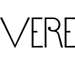
| Description: | Vere Dignum is a courageous collection of six alphabets, compiled into a family of three typefaces. The family seems to have been influenced by many wide ranging sources, including modernist geometric sans serifs (i.e., Erbar, Avenir, and ITC Avant Garde Gothic, classical monumental lettering, art nouveau, and art deco. The first of the three fonts, Vere Dignum Regular, contains two different interpretations of the alphabet. Both of them display uppercase letters only. When one types with "uppercase" letters on the keyboard, letters appear in various different sizes relative to each other. For example, e, h, o, and s are only half as tall as the other letters. Typing with the "lowercase" keys on the keyboard brings a different alphabet style, but in this one, all of the letters have the same height - it is their widths that vary. C, D, G, O, and Q are much wider than the other letters. Vere Dignum Regular contains a complete character set. Similarly, Vere Dignum Alternates contains another two alphabets. Many of these letters are very different from those in Vere Dignum Regular. These letters may all be used in combination with one another to create crazy lines of display text! Vere Dignum Decorative contains the last two alphabets of this series. As their name implies, these alphabets are significantly more "decorative" than their two counterparts. They are rounder and more curvilinear. All three fonts in the Vere Dignum family consist of letters that are drawn with almost mono-weight lines. Text set in Vere Dignum appears very light, as these lines are thin. Vere Dignum is best in for larger point sizes, but its display purposes need not be "dignified." A funky or fresh setting would be just as appropriate. The Vere Dignum family was designed in 2002 by the British graphic designer Phil Baines, and all three of its fonts are part of the Take Type 5 collection, from Linotype GmbH. |
| URL Vendor: | http://www.linotype.com |
| URL Designer: | http://www.linotype.com/fontdesigners |
| License Description: | NOTIFICATION OF LICENSE AGREEMENT You have obtained this font software either directly from Linotype GmbH or together with software distributed by one of Linotype's licensees. This font software is a valuable asset of Linotype GmbH. Unless you have entered into a specific license agreement granting you additional rights, your use of this font software is limited to your workstation for your own use. You may not copy or distribute this font software. If you have any questions regarding your license terms, please review the license agreement you received with the software. General license terms and usage rights can be viewed at www.linotype.com/license. Generelle Lizenzbedingungen und Nutzungsrechte finden Sie unter www.linotype.com/license. Pour plus d'informations concernant le contrat d'utilisation du logiciel de polices, veuillez consulter notre site web www.linotype.com/license. Linotype GmbH can be contacted at: Tel.: +49(0)6172 484-418 |
| License Info URL: | http://www.linotype.com/license |
| Typographic Family name: | Vere Dignum LT Std |
| Typographic Subfamily name: | Decorative |
Vere Dignum LT Std Decorative Measurement detail
| Every Pixel unit: | 1000 | Size of superscript horizontal font : | 650 |
| Horizontal minimum: | -41 | Size of superscript vertical font | 600 |
| Vertical minimum: | -142 | Superscript horizontal deviation | 0 |
| Horizontal maximum: | 1310 | Superscript vertical deviation | 75 |
| Vertical maximum: | 1000 | Size of subscript level font: | 700 |
| MacStyle: | 0 | Size of subscript vertical | 650 |
| Minimum readable pixel size: | 3 | Subscript horizontal offset: | 0 |
| Font directionHint: | 2 | Subscript vertical offset: | 477 |
| Ascending part: | 900 | Delete line size: | 50 |
| Descending part: | -100 | Delete line position: | 250 |
| Line spacing: | 500 | Font selection identifier: | 64 |
| Maximum step width: | 1320 | Typography ascending: | 900 |
| Minimum left side beraring: | -41 | Typography descending | -100 |
| Minimum right side beraring: | -355 | Typography spacing: | 500 |
| Horizontal maximum width: | 1310 | WindowsAscending part: | 1023 |
| Non component maximum points | 0 | WindowsDescending part: | 142 |
| Non component maximum contours | 0 | Bevel: | 0 |
| Word weight type: | 400 | Underline position: | -75 |
| Word width type: | 5 | Underline thickness: | 50 |
- ·Vere Dignum LT Std Regular
- ·Vere Dignum LT Std Decorative
- ·Vere Dignum LT Std Regular
- ·Vere Dignum LT Std Decorative
- ·Vere Dignum LT Std Regular
- ·Vere Dignum LT Std Decorative
- ·Vere Dignum LT Std Regular
- ·Vere Dignum LT Std Decorative
- ·Vere Dignum LT Std Decorative
- ·Vere Dignum LT Std Regular
- ·Vere Dignum LT Std Decorative
- ·Vere Dignum LT Std Regular
- ·Vere Dignum LT Std Decorative
- ·Vere Dignum LT Std Regular
- ·Vere Dignum LT Std Decorative
- ·Vere Dignum LT Std Regular
- ·Vere Dignum LT Std Decorative Version 2.100;PS 002.001;hotconv 1.0.38
- ·Vere Dignum LT Std Decorative Version 2.100;PS 002.001;hotconv 1.0.38
- ·Vere Dignum LT Std Decorative Version 2.100;PS 002.001;hotconv 1.0.38
- ·Vere Dignum LT Std Decorative Version 2.100;PS 002.001;hotconv 1.0.38
- ·Vere Dignum LT Std Decorative Version 2.100;PS 002.001;hotconv 1.0.38
- ·Vere Dignum LT Std Decorative Version 2.100;PS 002.001;hotconv 1.0.38
- ·Vere Dignum LT Std Decorative Version 2.100;PS 002.001;hotconv 1.0.38
- ·Vere Dignum LT Std Decorative Version 2.100;PS 002.001;hotconv 1.0.38
Recommended Font