


Fontke.com>Font>Vesta Pro SemiBold Italic Version 1.00
+ Follow
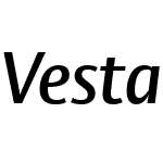 Vesta Pro SemiBold ItalicVersion 1.00
Vesta Pro SemiBold Italic Font main detail
| Font family: | Vesta Pro |
| Font style: | |
| Font version: | Version 1.00 |
| Typeface type: | |
| Characters: | 440 |
| Number of glyphs: | 696 |
| Font weight: | |
| Font width: | |
| Languages: | |
| Unicode blocks: | |
| Source: | |
| File format: | |
| License type: | |
| Font embedding license: | |
| Foundry: | |
| Designer: |
Vesta Pro SemiBold Italic Name detail
Microsoft - English (United States)
| Copyright notice: | Copyright © 2011 Linotype Corp., www.linotype.com. All rights reserved. This font software may not be reproduced, modified, disclosed or transferred without the express written approval of Linotype Corp. Vesta is a trademark of Linotype Corp. and may be registered in certain jurisdictions in the name of Linotype Corp. or its licensee Linotype GmbH. This typeface is original artwork of Gerard Unger. The design may be protected in certain jurisdictions. |
| Font family: | Vesta Pro SemiBold |
| Font Subfamily name: | Italic |
| Unique font identifier: | Linotype GmbH:Vesta Pro SemiBold Italic:2011 |
| Full font name: | Vesta Pro SemiBold Italic |
| Version string: | Version 1.00 |
| Postscript name: | VestaPro-SemiBoldItalic |
| Trademark: | Vesta is a trademark of Linotype Corp. and may be registered in certain jurisdictions in the name of Linotype Corp. or its licensee Linotype GmbH. |
| Manufacturer Name: | Linotype GmbH |
| Designer: | Gerard Unger |
| Description: | When Gerard Unger was doing the sketches for Capitolium, early in 1998, he considered proposing a sans serif for Rome based on the precursors of imperial Roman capitals. Few of these letters from the republican period have survived. They are partly geometrical, with circular Os, and have very little variation in thickness and very small serifs really not much more than thorns. It was from these letters that sans serifs were developed at the end of the nineteenth century (see Mosley, J., The Nymph and the Grot. The Revival of the Sanserif Letter, London, 1999). However, the Agenzia romana per la preparazione del Giubileo decided that a seriffed type would be more suitable for Rome. In the end he took Vesta (named after the temple of Vesta at Tivoli, the ancestral home of all sans serifs) and developed it further on his own initiative. The Roman geometry has gone, there is now a slight difference between thick and thin, and the letters are narrower. |
| URL Vendor: | http://www.linotype.com |
| URL Designer: | http://www.linotype.com/fontdesigners |
| License Info URL: | http://www.linotype.com/license |
| Typographic Family name: | Vesta Pro |
| Typographic Subfamily name: | SemiBold Italic |
Vesta Pro SemiBold Italic Measurement detail
| Every Pixel unit: | 1000 | Size of superscript horizontal font : | 650 |
| Horizontal minimum: | -107 | Size of superscript vertical font | 600 |
| Vertical minimum: | -227 | Superscript horizontal deviation | -12 |
| Horizontal maximum: | 1001 | Superscript vertical deviation | 75 |
| Vertical maximum: | 970 | Size of subscript level font: | 650 |
| MacStyle: | 2 | Size of subscript vertical | 600 |
| Minimum readable pixel size: | 9 | Subscript horizontal offset: | 55 |
| Font directionHint: | 2 | Subscript vertical offset: | 350 |
| Ascending part: | 970 | Delete line size: | 50 |
| Descending part: | -227 | Delete line position: | 305 |
| Line spacing: | 0 | Font selection identifier: | 1 |
| Maximum step width: | 1034 | Typography ascending: | 774 |
| Minimum left side beraring: | -107 | Typography descending | -226 |
| Minimum right side beraring: | -161 | Typography spacing: | 200 |
| Horizontal maximum width: | 1001 | WindowsAscending part: | 970 |
| Non component maximum points | 128 | WindowsDescending part: | 227 |
| Non component maximum contours | 7 | Bevel: | 589824 |
| Word weight type: | 600 | Underline position: | -75 |
| Word width type: | 5 | Underline thickness: | 50 |

- ·Vesta Pro SemiBold
- ·Vesta Pro Medium
- ·Vesta Pro ExtraBold
- ·Vesta Pro Black
- ·Vesta Pro SemiBold Italic
- ·Vesta Pro SemiBold
- ·Vesta Pro Regular
- ·Vesta Pro Medium Italic
- ·Vesta Pro Medium
- ·Vesta Pro ExtraBold Italic
- ·Vesta Pro ExtraBold
- ·Vesta Pro Bold
- ·Vesta Pro Black Italic
- ·Vesta Pro Black
- ·Vesta Pro Black
- ·Vesta Pro Medium
- ·Vesta Pro SemiBold
- ·Vesta Pro ExtraBold
- ·Vesta Pro Regular
- ·Vesta Pro Bold
- ·Vesta Pro SemiBold Italic Version 1.00
- ·Vesta Pro ExtraBold Italic Version 1.00
- ·Vesta Pro SemiBold Italic Version 1.00
- ·Vesta Pro ExtraBold Italic Version 1.00
- ·Vesta Pro Bold Italic Version 1.00
- ·Vesta Pro SemiBold Italic Version 1.00
- ·Vesta Pro ExtraBold Italic Version 1.00
- ·Vesta Pro Bold Italic Version 1.00
- ·Vesta Pro ExtraBold Italic Version 1.00
- ·Vesta Pro Bold Italic Version 1.00
- ·Vesta Pro SemiBold Italic Version 1.00
- ·Vesta Pro SemiBold Italic Version 1.00
- ·Vesta Pro ExtraBold Italic Version 1.00
- ·Vesta Pro Bold Italic Version 1.00
- ·Vesta Pro SemiBold Italic Version 1.00
- ·Vesta Pro ExtraBold Italic Version 1.00
- ·Vesta Pro Bold Italic Version 1.00
- ·Vesta Pro Bold Italic Version 1.00
Recommended Font