


Fontke.com>Font>GaudiND ☞ Version 1.00;com.myfonts.easy.neufville.gaudi-nd.gaudi-nd.wfkit2.version.Qsd
+ Follow
 GaudiND ☞Version 1.00;com.myfonts.easy.neufville.gaudi-nd.gaudi-nd.wfkit2.version.Qsd
GaudiND ☞ Font main detail
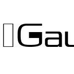
| Font family: | GaudiND |
| Font style: | |
| Font version: | Version 1.00;com.myfonts.easy.neufville.gaudi-nd.gaudi-nd.wfkit2.version.Qsd |
| Typeface type: | |
| Characters: | 309 |
| Number of glyphs: | 284 |
| Font weight: | |
| Font width: | |
| Languages: | |
| Unicode blocks: | |
| Source: | |
| File format: | |
| License type: | |
| Font embedding license: |
GaudiND ☞ Name detail
Microsoft - English (United States)
| Copyright notice: | © Copyright 1998, Neufville Digital. ALL RIGHTS RESERVED. This font is licensed, not sold, and may not be reproduced without the written consent of Neufville Digital. Parts © Visualogik Technology & Design and Morillas & Associats. The digitally encoded machine readable outline data for producing the typefaces licensed to you is copyrighted (c), 1998 by and the property of Visualogik, a subsidiary of VISINOVA bv. Design © Ricard Giralt Miracle, 1962. |
| Font family: | GaudiND |
| Font Subfamily name: | ☞ |
| Unique font identifier: | com.myfonts.easy.neufville.gaudi-nd.gaudi-nd.wfkit2.version.Qsd |
| Full font name: | ☞Gaudi ND |
| Version string: | Version 1.00;com.myfonts.easy.neufville.gaudi-nd.gaudi-nd.wfkit2.version.Qsd |
| Postscript name: | GaudiND |
| Trademark: | Gaudí is a registered trademark of Bauer Types SA. Unauthorised use prohibited. ALL RIGHTS RESERVED. Neufville Digital is a trademark of Visualogik, used with the permission of Neufville SL. |
| Manufacturer Name: | Neufville Digital |
| Designer: | Ricard Giralt Miracle (1962) |
| Description: | RICARD GIRALT MIRACLE Barcelona, 1911 - 1994 Graphic designer, typographer and printer, from the thirties on he devoted his talents to the design of posters, leaflets, book covers and bibliophile editions, and is regarded as one of the pioneers of graphic design in Spain. In 1947 he founded Filograf, Institut d'Art Gràfic, where he combined tradition and innovation to create trademarks, "plaquettes", kaleidoscopes, etc., as well as typefaces. In addition to the Gaudí, he also designed the Xenius, Helios, Gaya Ciencia, Biblos, Pompeya and Maryland typefaces. Among other awards he received the ADIFAD Delta d'Or (1962), the Premi Ciutat de Barcelona (1983), the ICOGRADA Graphic Design Excellence Award (1989) and the Spanish Premio Nacional de Diseño (1991). Ricard Giralt Miracle's relationship with letters and typefaces goes back to his childhood. His father, Francesc Giralt Ill, a noted lithographer, taught him to draw the different families of typefaces, particularly those of the Roman, English and Egyptian traditions, to which he subsequently added sans serif founts. His mastery of the anatomy and architecture of the letter enabled him not only to apply the classic founts with rigour and grace, but also to design new founts with a structural and aesthetic personality of their own. For him, letters were almost living things; it is significant that he defined typography as an occidental ikebana. He studied the thickness of the stems, the serifs, the fills and counters, the spaces between words and lines, in order to endow each fount with its own characteristic physiognomy. Of the many typefaces he created, the most widely used and highly acclaimed is the Gaudí, for which he was awarded a Delta d'Or by the ADIFAD; this combines the compositional spirit of Roman-lapidary inscriptions with that of modern sans serif typefaces. The orthogonal angles of the serifs establish a recurring rhythm and give uniformity to the capitals of this fount. |
| URL Vendor: | http://www.neufville.com |
| URL Designer: | http://www.neufville.com |
GaudiND ☞ Measurement detail
| Every Pixel unit: | 2048 | Size of superscript horizontal font : | 1229 |
| Horizontal minimum: | -47 | Size of superscript vertical font | 1331 |
| Vertical minimum: | -436 | Superscript horizontal deviation | 0 |
| Horizontal maximum: | 2712 | Superscript vertical deviation | 121 |
| Vertical maximum: | 2101 | Size of subscript level font: | 1229 |
| MacStyle: | 0 | Size of subscript vertical | 1331 |
| Minimum readable pixel size: | 8 | Subscript horizontal offset: | 0 |
| Font directionHint: | 2 | Subscript vertical offset: | 559 |
| Ascending part: | 1579 | Delete line size: | 80 |
| Descending part: | -469 | Delete line position: | 520 |
| Line spacing: | 651 | Font selection identifier: | 64 |
| Maximum step width: | 2892 | Typography ascending: | 1579 |
| Minimum left side beraring: | -47 | Typography descending | -469 |
| Minimum right side beraring: | -82 | Typography spacing: | 651 |
| Horizontal maximum width: | 2712 | WindowsAscending part: | 2182 |
| Non component maximum points | 150 | WindowsDescending part: | 517 |
| Non component maximum contours | 7 | Bevel: | 0 |
| Word weight type: | 400 | Underline position: | -180 |
| Word width type: | 5 | Underline thickness: | 80 |
Recommended Font