-
Nomade, A Man of Letters Looking Out Over The Mediterranean
I'm back from our family vacation since Monday night. Of course,
News The FontFeed Yves Peters 2010-08-12 04:14:23
-
ScreenFonts: Killers, The A-Team, The Karate Kid, I Am Love, The Killer Inside Me, Knight And Day
I just made an executive decision. Hold on, what did I just say?
News The FontFeed Yves Peters 2010-07-17 03:25:42
-
Biome — the making of a typeface
A biome in nature is essentially an ecosystem. It's also the name
News I Love Typography Carl Crossgrove 2010-07-02 07:54:55
-
Jonas & François Do It Again For Audio Bullys "Only Man"
You just gotta love the French for their flawless pop sensibiliti
News The FontFeed Yves Peters 2010-06-08 20:17:47
-
I wonder about the importance of typeface library brand when it c
News Fonts.com Blog Allan Haley 2010-06-02 12:56:55
-
TYPO Berlin 2010 "Passion" In Full Swing
Day three of TYPO Berlin has kicked off with an interesting and e
News The FontFeed Yves Peters 2010-05-22 16:49:05
-
ScreenFonts: Alice In Wonderland, Green Zone, Mother, The Runaways, Repo Men, Chloe
It strikes me how frequently the promotional campaigns of (mainst
News The FontFeed Yves Peters 2010-05-01 05:16:02
-
ScreenFonts: From Paris With Love, The Wolfman, Ghostwriter, The Crazies, Cop Out, A Prophet
Oy vey, ridiculously late episode. This time the extensive TDC2 p
News The FontFeed Yves Peters 2010-04-13 03:52:50
-
We're making steady progress here – the only thing that bugs me i
News The FontFeed Yves Peters 2010-04-02 18:40:31
-
Brian Eno & David Byrne and Neil Young Album Covers Win Grammy Awards
Award season has officially come into full swing. Now the Hollywo
Activity The FontFeed Yves Peters 2010-02-02 01:55:51
-
Digital Arts January 2010 issue with brand new look out now!
The January issue of Digital Arts is on sale now, featuring a sty
News Digital Arts 2009-12-17 12:54:23
-
Matthew Carter 2004 Talk "Truth to Materials" Added To TYPO Berlin VideoBlog
Passion, the 15th edition of TYPO Berlin, probably Europe's large
News The FontFeed Jürgen Siebert 2009-12-03 21:29:06
-
Aha, here's the October episode of ScreenFonts. "But wait, Yves,"
News The FontFeed Yves Peters 2009-12-02 05:34:44
-
Ray Davies said he knows what he is, he's glad he's a man and so'
News Kevin Walsh 2009-12-01 23:06:11
-
ScreenFonts: Gamer, Love Happens, Bright Star, The Informant, Fame
I have to warn you this is a somewhat lean episode. There's not m
News The FontFeed Yves Peters 2009-10-14 03:07:42
-
Focus On FontStructors – Peter De Roy (typerider)
This is the seventh in our series of mini-interviews with FontSt
News The FontFeed Yves Peters 2009-10-11 04:11:44
-
Long time Adobe InDesign product manager Will Eisley is so dedica
News The FontFeed Jürgen Siebert 2009-10-08 15:10:08
-
New FontFonts: The Creation of FF Unit Slab
One of the things the FontFont foundry is known for are its succe
News The FontFeed Yves Peters 2009-08-18 03:49:31
-
ScreenFonts: Public Enemies, Brüno, I Love You Beth Cooper, Soul Power, In The Loop
It's summer, the sun's out, and it's hot. While we Belgians have
News The FontFeed Yves Peters 2009-08-07 06:16:09
-
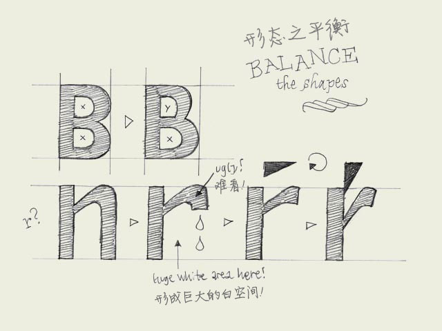
Balance shapes. If you make both of the inner forms (counters) of the 'B' exactly the same, the top counter will optically look bigger. Your character will look plumby, like it's falling down. If you make the top counter smaller than the bottom one,
Design typeworkshop.com 翻译/snlchina 2007-12-01 23:44:46
-
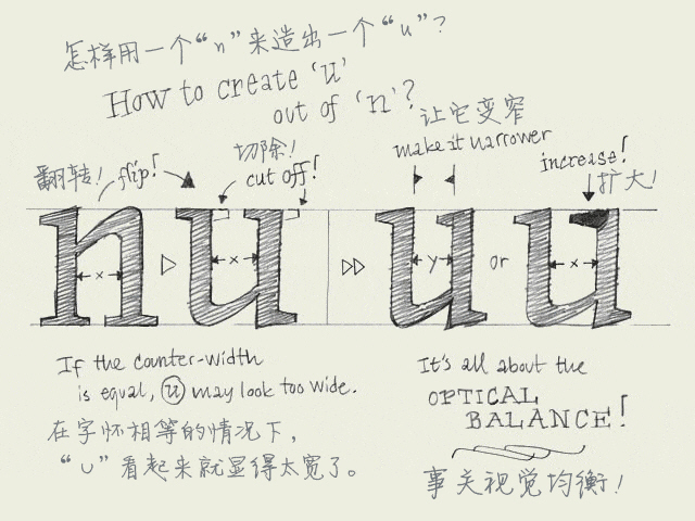
Copy-paste? When you have created a few basic characters, you also want to create the rest of the alphabet. But how? Copy and paste? Euhm, not really. Although, this can help you on the way.当你设计了几个基本的字符,你还想继续完成整个字母表。该怎样
Design typeworkshop.com 翻译/snlchina 2007-12-01 23:43:37
-
ScreenFonts: Star Trek, X-Men Origins: Wolverine, Angels & Demons, The Limits Of Control
We're past halfway June, so it's high time for taking a look at t
News The FontFeed Yves Peters 2009-06-19 06:43:23
-
Readability. The only important aspect of a text typeface is the readability. Many decisions can influence the readability. Which contrast you create, the length of the ascenders and descenders, the rhythm, the blackness of a type, the strength
Design typeworkshop.com 翻译/snlchina 2007-11-19 23:32:56
-
Italic vs. cursive. A roman font can be slanted (having an angle) and a cursive font can be upright (totally vertical like a roman). Urgh!一个罗马体(roman,通常也被译作”正体“)可以是倾斜的(有一定的倾角),而一个草写体可以是竖直的(就
Design typeworkshop.com 翻译/snlchina 2007-11-15 23:29:21
-
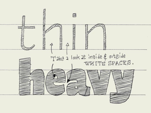
Black vs. white. Designing type is nothing more and nothing less than harmonizing black and white shapes. Black can't exist without white, and white can't exist without black. Black, the shape of a letter. White, the space in or in between letters. T
Design typeworkshop.com 翻译/snlchina 2007-11-15 23:28:15
- Mobile
- Service
-
Navigation
- Channels
- Clients


