


Making "Character Codes" Look Better
In my work, I need to deal with character codes on a regular basis, such as Unicode scalar values and hexadecimal values for legacy encodings. This includes writing documents that include them. For most purposes, especially when used in tables, tabular figures work best because they are monospaced. Of course, one could simply choose to use a monospaced font. But, unless a different font is actually desired for character codes, using the same typeface design is usually preferred, because it better matches the surrounding text. The issue is that very few, if any, fonts include tabular glyphs that support hexadecimal notation, specifically referring to 'A' through 'F' (or 'a' through 'f' for lowercase). Luckily, I was able to solve this particular dilemma.
When I wrote my first two books, Understanding Japanese Information Processing (O'Reilly & Associates, 1993) and CJK Information Processing (O'Reilly & Associates, 1999), I simply used a different font for character codes that were used in the many tables. If memory serves, the font was Courier or a derivative. However, when I wrote my third book, CJK Information Processing, Second Edition (O'Reilly Media, 2009), OpenType offered the possibility of making the character codes look better, both in body text and in tables.
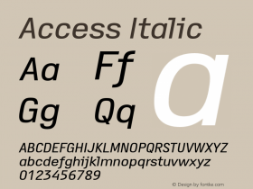
I am grateful that my esteemed colleague, Miguel Sousa, created special (and private) versions of specific faces of the Adobe Originals Myriad Pro and Minion Pro that included, as alternate glyphs, tabular versions of the following characters: 'a' through 'f', 'x', 'A' through 'G', 'U', 'V', 'X', and '+'. These glyphs were made accessible through the use of the 'Adobe InDesign character styles for character codes, for use in body text and in tables, I was able to specify this particular OpenType feature. I also specified the 'zero' (Slashed Zero) GSUB feature so that all instances of 0 (zero) were slashed to better distinguish them.
In terms of design, Miguel not only needed to make the glyphs tabular, to match the widths of the (default) tabular figures, he also needed to make the uppercase height match that of the figures.
Below is an excerpt from the book, specifically Table 4-3 that appears on page 198 in Chapter 4 (Encoding Method), which shows the tabular Myriad Pro glyphs being used:

Below is another excerpt from the book, from page xxviii of the Preface, which shows the tabular Minion Pro glyphs being used:

I continue to use these private versions of Myriad Pro and Minion Pro for other document-writing purposes.


-
 ShanhaiFonts
Brand:山海字库
Area:China

-
 Cangji Fonts
Brand: 仓迹字库
Area: China
-
 JT Foundry
Brand: 翰字铸造
Area: Taiwan, China

-
 Handmadefont
Brand:
Area: Estonia

-
·千图字体
-
 HyFont Studio
Brand: 新美字库
Area: China


- ·Statement and Counter-Statement, Automatically Arranged Alphabets, and Arts/Rats/Star
- ·XUID Arrays: One Less Thing To Worry About
- ·10 Top Romantic Fonts on Valentine's Day!
- ·Benetton identity redesign
- ·Sinnesreize / Embracing Sensation by Silvia Gertsch and Xerxes Ach
- ·London Underground's iconic Johnston Sans typeface
- ·Type terms: the animated typographic cheat sheet
- ·Make market-ready fonts with this 8 point checklist
- ·Quimbaya Coffee Roasters
- ·"Jesus Music" ad for Myrrh Records