


Fontke.com>Article>Details
诺基亚正式公布新字体Nokia Pure
Introduction上周,诺基亚以一场艺术展的形式宣布了新设计字体Nokia Pure。不过,从那些经过艺术变形的字母海报中,我们还很难对这种即将成为
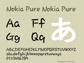
上周,诺基亚以一场艺术展的形式宣布了新设计字体Nokia Pure。不过,从那些经过艺术变形的字母海报中,我们还很难对这种即将成为亿万诺基亚手机统一形象的新字体有一个较为具体的印象。上周末,诺基亚终于在官方博客中公布了Nokia Pure字体的标准形象。
诺基亚给Nokia Pure字体给出的形容是“极实用性中的美丽”,由诺基亚设计团队和瑞士裔设计师Bruno Maag共同打造。目前公布的设计有标准版、细体、粗体三种英文样式,未来还将以相同风格推出多种语言。文中提到的包括阿拉伯语、希腊语、日语,中文想必也将涵盖其中。


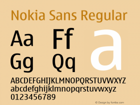
下面这张“CE”字母的组合最能体现出新字体的特色,两个字母像互相吸引一般,体现出一种动态感,和现有诺基亚手机的标准字体Nokia Sans则有明显的区别。

左为新字体 右为现有字体
Relevant font family
Relevant font designer

Relevant font foundry

诺基亚正式公布新字体Nokia Pure Comments
诺基亚正式公布新字体Nokia Pure Latest comments
No relevant comments
-
 Cangji Fonts
Brand: 仓迹字库
Area: China

-
 JT Foundry
Brand: 翰字铸造
Area: Taiwan, China

-
 Handmadefont
Brand:
Area: Estonia

-
·千图字体
-
 HyFont Studio
Brand: 新美字库
Area: China
-
 Minrui Type
Brand: 敏锐字库
Area: China


Recommended font article
- ·Type terms: the animated typographic cheat sheet
- ·London Underground's iconic Johnston Sans typeface
- ·Iconic Transport for London logo undergoes subtle redesign
- ·The Form Book by Borries Schwesinger
- ·XUID Arrays: One Less Thing To Worry About
- ·Sinnesreize / Embracing Sensation by Silvia Gertsch and Xerxes Ach
- ·New York New York, Jazz St. Louis
- ·Surabaya Beat by Beat Presser, Afterhours Books
- ·10 Top Romantic Fonts on Valentine's Day!
- ·How to Read a Painting by Patrick de Rynck