The Autobiography of Michel de Montaigne


Source: http://designarchives.aiga.org.AIGA Design Archives. License: All Rights Reserved.
"My friend David Godine and I conceived this book as a very small format hardcover in the manner of Jean de Tournes, the 16th-century French master. Later, when we realized that the greatest potential audience for the book would be college students, we dropped the conceit and decided to publish it as a paperback (only) in standard format. I decided we ought to go out in style and make this edition an especially elegant one, classical and generous in its proportions, printed inside and out on especially nice textured papers.
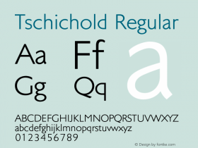
I made my first text typeface especially for this great classic (which was first planned six years before it went into production), though it appeared in a number of titles published before this one. It is called Montaigne Sabon, inspired in part by some drawings for a never-realized foundry version of Jan Tschichold's famous Sabon types. The result is a very restrained design of generous proportions intended for long-haul reading at 11–12 point size." — Scott-Martin Kosofsky

Source: http://designarchives.aiga.org.AIGA Design Archives. License: All Rights Reserved.
-
 ShanhaiFonts
Brand:山海字库
Area:China

-
 Cangji Fonts
Brand: 仓迹字库
Area: China

-
 JT Foundry
Brand: 翰字铸造
Area: Taiwan, China

-
 Handmadefont
Brand:
Area: Estonia

-
·千图字体
-
 HyFont Studio
Brand: 新美字库
Area: China

- ·"Die Alpen – Vielfalt in Europa" stamp
- ·He Invented a Font to Help People With Dyslexia Read
- ·The Form Book by Borries Schwesinger
- ·The Great Comic Book Heroes, by Jules Feiffer
- ·Once Upon DESIGN: New Routes for Arabian Heritage
- ·Chinese College Student Invents Smog Font
- ·How to sell your typefaces
- ·Königsblut identity
- ·Antropofagia. Palimpsesto Selvagem
- ·"David Bowie is turning us all into voyeurs" button


