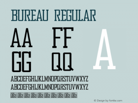
Fortune Magazine, 2007


Source: http://www.fontbureau.com.License: All Rights Reserved.
Known for considering the entire field of business as its purview, content-rich Fortune magazine ventured into its first redesign in ten years with bolder photos, more white space, color-coded sections and all new typography.
Kent Lew's award-winningWhitmanis the serif type family with a range of expanded styles drawn for text, display, and titling. Design Director Bob Perino, said of Whitman, "The more I see it, the more I love it. It is strong and elegant. I couldn't have asked for a better font."
Also used in the redesign are Christian Schwartz'sPopular, a new slab serif, giving the right complimentary heft, and from Cyrus Highsmith and Tobias Frere-Jones, the clean and beautifulBenton Sans, invested well as both large display and body copy.

Source: http://www.fontbureau.com.License: All Rights Reserved.

Source: http://www.fontbureau.com.License: All Rights Reserved.

Source: http://www.fontbureau.com.License: All Rights Reserved.

Source: http://www.fontbureau.com.License: All Rights Reserved.

Source: http://www.fontbureau.com.License: All Rights Reserved.

Source: http://www.fontbureau.com.License: All Rights Reserved.

Source: http://www.fontbureau.com.License: All Rights Reserved.

Source: http://www.fontbureau.com.License: All Rights Reserved.
-
 ShanhaiFonts
Brand:山海字库
Area:China

-
 Cangji Fonts
Brand: 仓迹字库
Area: China

-
 JT Foundry
Brand: 翰字铸造
Area: Taiwan, China

-
 Handmadefont
Brand:
Area: Estonia

-
·千图字体
-
 HyFont Studio
Brand: 新美字库
Area: China

- ·Why Apple Abandoned the World's Most Beloved Typeface?
- ·"Jesus Music" ad for Myrrh Records
- ·Once Upon DESIGN: New Routes for Arabian Heritage
- ·Fonts Design of Childhood Memory
- ·Alibaba Supports Font Infringement Complaints
- ·Antropofagia. Palimpsesto Selvagem
- ·XUID Arrays: One Less Thing To Worry About
- ·Make market-ready fonts with this 8 point checklist
- ·The Future of Sex poster
- ·Type terms: the animated typographic cheat sheet


