


Fontke.com>Article>Details
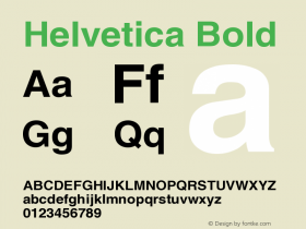
太像了吧?!你能分辨出Arial和Helvetica字体的区别么?做个测试吧!
Introduction蒙纳字体(MonoType Imaging)的Arial,自1982年来已经收到了不少公平分享方面的批评,其长期以来一直被视为是H
蒙纳字体(MonoType Imaging)的Arial,自1982年来已经收到了不少公平分享方面的批评,其长期以来一直被视为是Helvetica明显丑陋的替身。微软支持Arial作为Helvetica的替代以避免支付版税,只让事情变得更加糟糕。专业排版人员和字体设计师们可以轻松分辨出这两种字体,但因为设计进一步嵌入到了主流,排版评论家们就如雨后春笋般地冒出。
对此,Ironic Sans的David Friedman创建了一个测验,把基于Helvetica字体的LOGO用Arial字体重建了一份。如Friedman所说,"有些人认为这是亵渎。我把这称作一个挑战:你能告诉我哪个是原始的,哪个又是重塑过的吗?(下图)"
这听起来似乎很容易,但考虑到Arial和Helvetica是如此类似,许多人会发现这个测验相当有挑战性。如果熟记一些特定的Helvetica字符(如"R"和"Q"),应该会有所帮助。
测试链接:http://www.ironicsans.com/helvarialquiz/
[via Hacker News]
[编译自:TNW]
Relevant font family


太像了吧?!你能分辨出Arial和Helvetica字体的区别么?做个测试吧! Comments
太像了吧?!你能分辨出Arial和Helvetica字体的区别么?做个测试吧! Latest comments
No relevant comments
-
 ShanhaiFonts
Brand:山海字库
Area:China

-
 Cangji Fonts
Brand: 仓迹字库
Area: China
-
 JT Foundry
Brand: 翰字铸造
Area: Taiwan, China

-
 Handmadefont
Brand:
Area: Estonia

-
·千图字体
-
 HyFont Studio
Brand: 新美字库
Area: China


Recommended font article
- ·Surabaya Beat by Beat Presser, Afterhours Books
- ·Königsblut identity
- ·Cher Got Sued For Font!
- ·"Die Alpen – Vielfalt in Europa" stamp
- ·Quimbaya Coffee Roasters
- ·MC5 – Back in the USA album cover
- ·Why Apple Abandoned the World's Most Beloved Typeface?
- ·10 Top Romantic Fonts on Valentine's Day!
- ·20 Houses. A New Residential Landscape exhibition, Wallpaper* Architects Directory
- ·Iconic Transport for London logo undergoes subtle redesign