


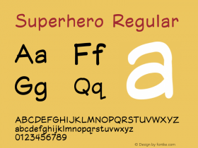
超级英雄字体海报

Minnesota-based designer Matthew Olin created a series of superhero typographic posters for his MFA Thesis exhibition entitled Some Type of Hero. Olin chose fonts whose characters reflected the characteristics of the superheroes we know and love, and then recreated them in these eye-catching posters.
美国明尼苏达州的设计师马文奥林为他的MFA(艺术硕士)学位毕业展览创作了一系列超级英雄字体海报,这些海报以不同类型的英雄命名。奥林挑选了能够反映出超级英雄们性格的字体,再用这些字体重新创作出了这些令人惊叹的海报。

无衬线体:坚定与从容——推动建立制度与威信/
西文字体分为Serif(衬线体)与Sans Serif(无衬线体),详细摸百度百科,或者维基百科。
As Olin says:
奥林解释:
The most distinguishing factor of any font is its characters. Hidden beneath these characters, each typeface also has character—its own unique characteristics. However classified this information may seem, when used correctly, typefaces often speak to us more powerfully than the words that are written with them.
字体间的最大区别在于字体的性格(不同的字体族)。影藏在这些字体族之下的每一型字体,也具有其独特的性格。把这些信息归类,就能看见,只要使用得当,字型本身表达给我们的内容比单纯的写字要强烈的多。

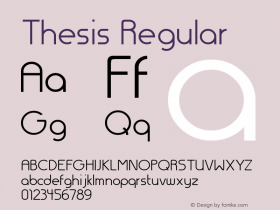
迪多体:聪明而时髦——隐藏在重力之中的优美曲线使其影响深远。

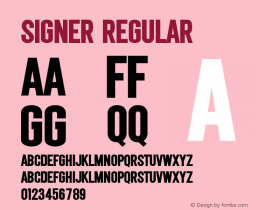
衬线体:暗含传统价值观——在所有办法都无济于事时提供希望。

黑体:古老的原力——梳理出生动而又繁杂的个性。

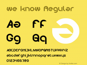
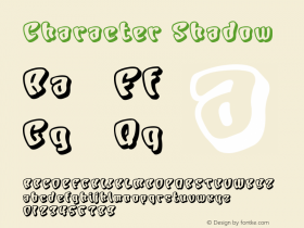
手写体:快速又灵敏——加速运动,领悟和反映力。

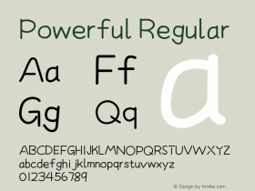
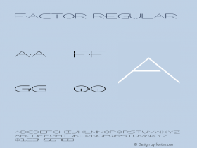
粗衬线体:通常有力而伟岸——一种直接而进化的变体。

显示体:独特而又自成一格——每一个都有各自的个性和力量。

Which type superhero would you want to be?
你想成为哪一类超级英雄?
Read more at Design Milk: http://design-milk.com/superhero-typographic-posters-by-matthew-olin/#ixzz24d1QFbAY
更多内容:Design Milk


-
 ShanhaiFonts
Brand:山海字库
Area:China

-
 Cangji Fonts
Brand: 仓迹字库
Area: China
-
 JT Foundry
Brand: 翰字铸造
Area: Taiwan, China

-
 Handmadefont
Brand:
Area: Estonia

-
·千图字体
-
 HyFont Studio
Brand: 新美字库
Area: China


- ·Why Apple Abandoned the World's Most Beloved Typeface?
- ·"David Bowie is turning us all into voyeurs" button
- ·The Future of Sex poster
- ·Statement and Counter-Statement, Automatically Arranged Alphabets, and Arts/Rats/Star
- ·Make market-ready fonts with this 8 point checklist
- ·Alibaba Supports Font Infringement Complaints
- ·How to sell your typefaces
- ·Königsblut identity
- ·Moving Hands (Helena Hauff Remix) by The Klinik, official video
- ·Cher Got Sued For Font!