


TDC² Typeface Winners
Winners of the Type Directors Club's TDC² competition were notified last week. To get a semi-jump on bragging rights (the TDC gave winners permission to boast), I thought I'd provide some behind-the-scenes observations on our winning entries. The TDC won't be making its official announcement until March.
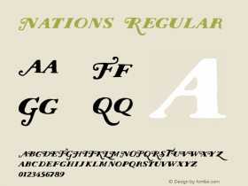
Elegy
The Elegy™ typeface is simply gorgeous. If it were a wedding dress, I imagine it to be the purest of whites with flowing lace and a long, lavish train. Such a feminine description might not fly with Jim Wasco, senior typeface designer at Monotype Imaging, who created this beautiful face.
Elegy is based on the original, handlettered logo of the International Typeface Corporation, which flourished in the 70s from its New York City headquarters. The logo was designed by the legendary typeface designer Ed Benguiat, who created such well used faces as the ITC Bookman®, ITC Edwardian Script™ and ITC Benguiat® families.

With an eye toward maintaining the spontaneity and flowing attributes of the ITC logo, Jim set out to create a contemporary design based on an American form of ornamental penmanship called Spencerian script, popular from about 1850 to 1925. Close your eyes and picture the Coca-Cola logo. A Spencerian script, the Coca-Cola identity was first published in the late 19th century.
What was unique about designing Elegy?First off, it was difficult. "Elegy was the most difficult design job I've ever done in my life," Jim says, "from getting the shapes right to designing alternatives for each letter in order to take advantage of OpenType's contextual alternate feature." This allows letters to be substituted in specific combinations, which enables text to take on the look of handwritten letters. Jim also designed the initial and final strokes for the beginnings and endings of words.
Does the design experience trigger anything funny?"Funny, no. Scary, yes," Jim says. Scary as in fear that people will not use the typeface correctly. Jim adds, "I've already seen an example where an alternate nine old style figure was used instead of a zero. Now that's scary!"
What's the most important thing about Elegy?It needs to be used in the latest applications that support OpenType® features, such as old style figures, arbitrary fractions, proportional numbers, tabular numbers, discretionary ligatures and of course, contextual alternate characters. Because of its fine hairline strokes and various design nuances, Elegy should not be used in all caps or sizes under 24 point.
Check out this animated video of Elegy. You'll get a sense of its graceful beauty in all its glory.
Palatino Sans Arabic
My next blog post will cover the TDC² award-winning Nadine Chahine, who collaborated with master typeface designer, Hermann Zapf.


-
 ShanhaiFonts
Brand:山海字库
Area:China

-
 Cangji Fonts
Brand: 仓迹字库
Area: China
-
 JT Foundry
Brand: 翰字铸造
Area: Taiwan, China

-
 Handmadefont
Brand:
Area: Estonia

-
·千图字体
-
 HyFont Studio
Brand: 新美字库
Area: China


- ·Food Not Bombs hypothetical redesign
- ·Bevésett nevek (Carved Names), vol. 2
- ·Sinnesreize / Embracing Sensation by Silvia Gertsch and Xerxes Ach
- ·Moving Hands (Helena Hauff Remix) by The Klinik, official video
- ·Brother Moto Flat-Trackin' Tee
- ·He Invented a Font to Help People With Dyslexia Read
- ·How to sell your typefaces
- ·Linotype Ad: "Linotype vs. Intertype"
- ·"Die Alpen – Vielfalt in Europa" stamp
- ·How to Read a Painting by Patrick de Rynck